Localizing Text
Customizing text components
Your Frontegg app contains textual elements, such as titles, labels, input placeholders, alerts, and more.
The following guide covers how to customize these text elements within your Frontegg application.
Hosted vs. Embedded
Note that the way to customize textual elements differs between the hosted and the embedded Frontegg integrations.
Getting Started
Thelocalizations initiation attribute, you can customize the text that appears in your Frontegg components— you can set custom button text, add custom input placeholders, write your own input labels, display custom error messages, and more.
To set the values for your custom text, you need to create a localizations object containing the text content for the parts you want to customize. Pass that object as an attribute into your FronteggProvider at initialization.
Localizations Object
The outermost key in the localization object is for language. For instance, for English the key is en.
Within each language key is an object with keys for the adminPortal and loginBox. Within each of those objects are options to customize the text within.
Use more than one language key to customize the text in multiple languages. Here is an example with two language keys where each key has sections for the adminPortal and loginBox.
const localizations = {
    en: {
      adminPortal: {
        // Your code here,
      },
      loginBox: {
        // Your code here,
      },
    },
    es: {
      adminPortal: {
        // Your code here,
      },
      loginBox: {
        // Your code here,
      },
    },
  };
Admin Portal and Login Box Options
Frontegg provides access to the localization code so you can easily customize your textual elements. The following section will guide you on how to create your localizations object.
In your installed Frontegg package, you will find the frontegg/types/Localizations folder.
Localizations In The Code Editor
Your code editor might show all the options with captions explaining what each is for.
The structure of folders and files is designed to mirror the structure of the localizations object. The outermost key in the object is localizations. The next level of keys includes the adminPortal and loginBox, and within them, you have theAdminPortalLocalizations and LoginBoxLocalizations.
The LoginBoxLocalizations and AdminPortalLocalizations subfolders contain files. Each file corresponds to a key in the localizations object. You can find the name of the key for that file inside the file.
In frontegg/types/Localizations/LoginBoxLocalizations/login.d.ts is an object with a key of login. Inside the login object in the login file are your options for customizing the text in the login page.
Here is an excerpt from the login file:
export interface LoginLocalization {
    /**
     * strings in login page
     */
    login: {
        // Login page localizations listed here
    };
}
In the localizations object within the loginBox object, use the same login key you found in the login file and include any custom text using the keys you found in the login file's login object:
const localizations = {
  en: {
    loginBox: {
      login: {
       // Your customizations here
      },
    },
  },
};
Let's add another key to the loginBox. In frontegg/types/Localizations/LoginBoxLocalizations/signup.d.ts you'll find an object with a key of signup. Inside that signup object you have options to customize the text of the signup page.
Here is an excerpt from the signup file:
export interface LoginLocalization {
    /**
     * strings in signup page
     */
    signup: {
        // Signup page localizations listed here
    };
}
Your localizationsobject allows you to add customization to the text for both the login and signup pages, by including it for the corresponding keys you found in the login signup files' objects.
const localizations = {
  en: {
    loginBox: {
      login: {
        // Your customizations here
      },
      signup: {
        // Your customizations here
      },
    },
  },
};
Object Integration
When integrating the Frontegg Provider, pass localizations as an initialization attribute. The value for localizations needs to be an object containing your custom content.
You do not need to provide values for all localizations options. You can include in your localizations object values for only the places you want to customize.
Here is a simple example:
const localizations = {
    en: {
      adminPortal: {
        profile: {
          informationTitle: "Acme",
        },
      },
      loginBox: {
        signup: {
          nameInputPlaceholder: "Your Acme username",
          emailInputLabel: "Acme Email",
          emailInputPlaceholder: "Your Acme email",
        },
      },
    },
  };

<FronteggProvider contextOptions={contextOptions} localizations={localizations}>
  <App />
</FronteggProvider>
In the example above, the code sets custom text in the Admin Portal and the Login Box. Specifically, in the Admin Portal's profile section, the code sets the information title. In the Login Box on the signup page, the code sets two placeholders and a label.
Examples
Here are some examples of popular and practical use cases for customizing text.
Social Login Button Text
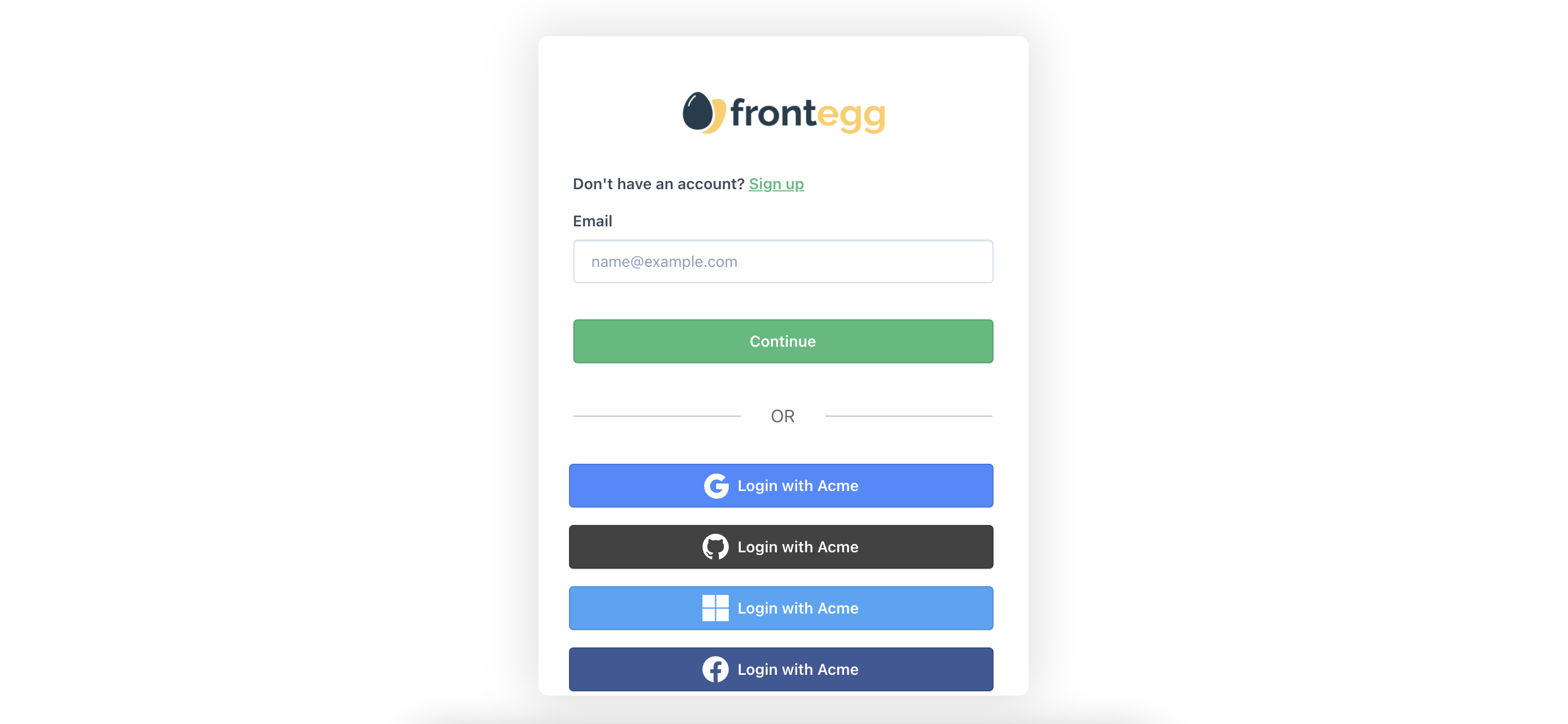
Set the text of your social login buttons. In localizations --> loginBox --> socialLogins, you can set custom text for the social login buttons.
Here is an example of the options with explanations:
const localizations = {
    en: {
      loginBox: {
        socialLogins: {
          /**
           * Text to be display in socialLogin buttons if rendering inside login section
           * Ex: 'Continue with {{providerName}}'
           */
          loginButtonText: "Login with Acme",
          /**
           * Text to be display in socialLogin buttons if rendering inside signup section
           * Ex: 'Login with {{providerName}}'
           */
          signupButtonText: "Signup with Acme",
          /**
           * Text to be display in socialLogin buttons if rendering inside activation section
           * Ex: 'Sign up with {{providerName}}'
           */
          activationButtonText: "Signup with Acme",
          /**
           * Error title if social login callback is invalid
           */
          failedInvalidCallbackUrl: "Please try again.",
          /**
           * Back to login button text in social login invalid section
           */
          failedBackToLogin: "Login with Acme",
        },
      },
    },
  };
The code above
The code sample above is from
frontegg/types/Localizations/LoginBoxLocalizations/socialLogins.d.ts.
Here is what the code above looks like:
Submit Button Text
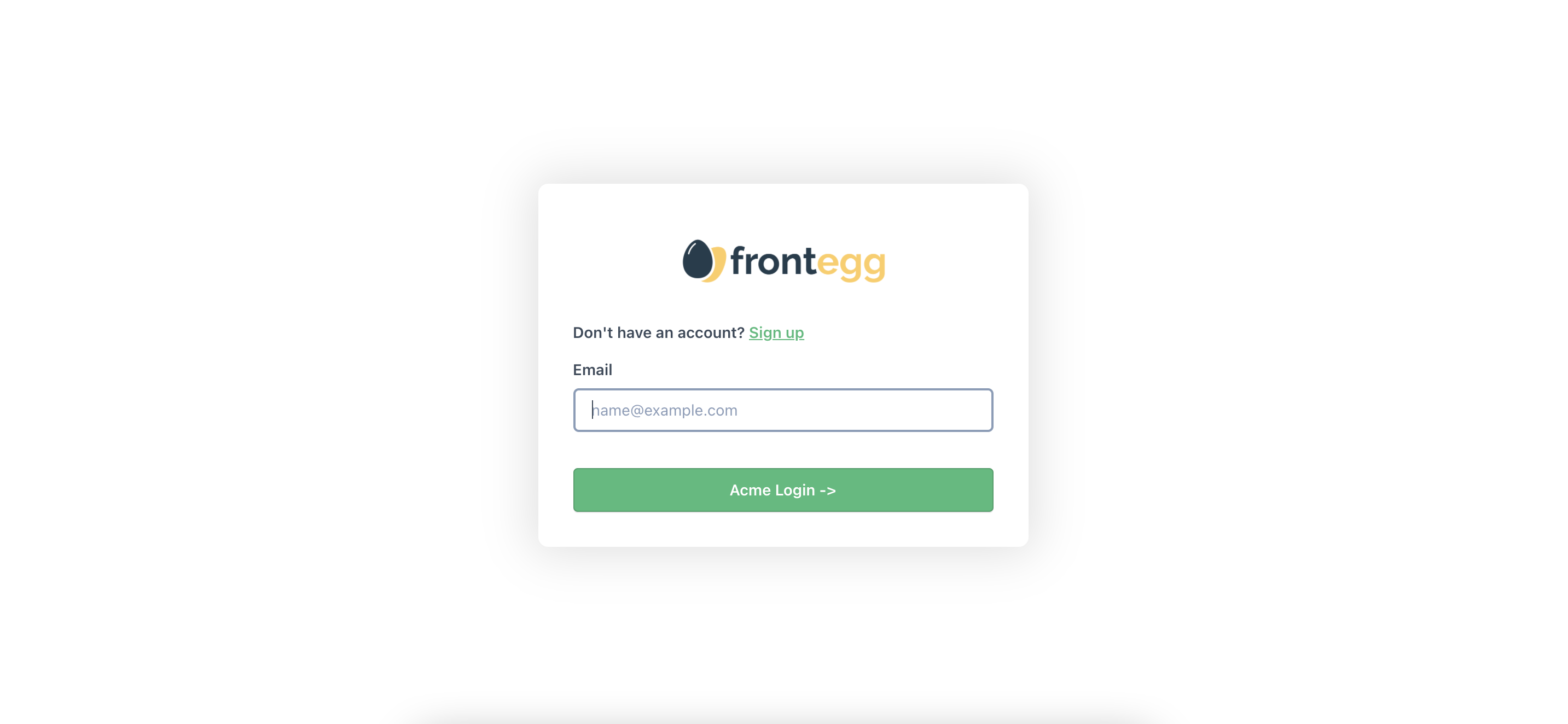
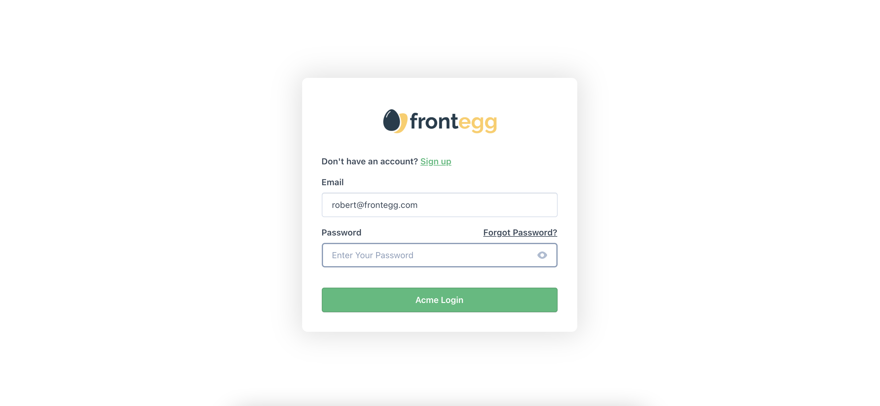
Set the text of your submit buttons. In various subsections within the loginBox section of your localizations object, you can set custom text for the submit buttons. You have several options based on the context and subsection.
Here is an example of two options with explanations within the login and signup subsections:
const localizations = {
    en: {
      loginBox: {
        login: {
          /**
           * Login page submit button
           */
          login: "Acme Login",
          /**
           * Login page submit button if passwordless, sso or magicLink is enabled
           */
           continue: "Acme Login ->",
        },
        signup: {
          /**
           * Signup page submit button
           */
          signupButtonText: "Signup",
        },
      },
    },
  };
The code above
The code in the sample above is from
frontegg/types/Localizations/LoginBoxLocalizations/login.d.tsandfrontegg/types/Localizations/LoginBoxLocalizations/signup.d.ts.Review those and other files within
frontegg/types/Localizations/LoginBoxLocalizations/for more options. Searching for the wordbuttonin a file will help you find relevant results for buttons.
Here is what the code above looks like on the login page:
Login Label Texts
Set the text of the labels in your Login Box. In the loginBox section of your localizations object, you can set custom text for the input labels.
You have several options based on the context.
Here is an example of label options with explanations for both the login and signup` sections.
const localizations = {
    en: {
      loginBox: {
        login: {
          /**
           * Login email input label
           */
          emailInputLabel: "Please enter your email",
          /**
           * Login password input label
           */
          passwordInputLabel: "Please enter your password",
          /**
           * Login with MFA six digits input label If MFA is enabled
           */
          mfaInputLabel: "Please enter your 6 digits",
          /**
           * Otc input label
           */
          otcInputLabel: "OTC Login Here",
          /**
           * Force MFA section input label
           */
          forceMfaInputLabel: "Force MFA Here",
        },
        signup: {
          /**
           * Signup name input label
           */
          nameInputLabel: "Please enter your name",
          /**
           * Signup email input label
           */
          emailInputLabel: "Please enter your email",
          /**
           * Signup password input label
           */
          passwordInputLabel: "Please enter your password",
          /**
           * Signup company name input label
           * this input is optional
           */
          companyNameInputLabel: "Please enter your company name",
        },
      },
    },
  };
The code above
The code in the sample above is from
frontegg/types/Localizations/LoginBoxLocalizations/login.d.tsandfrontegg/types/Localizations/LoginBoxLocalizations/signup.d.ts.Review those and other files within
frontegg/types/Localizations/LoginBoxLocalizations/for more options. Searching for the wordlabelin a file will help you find relevant results.
Login-Signup Text
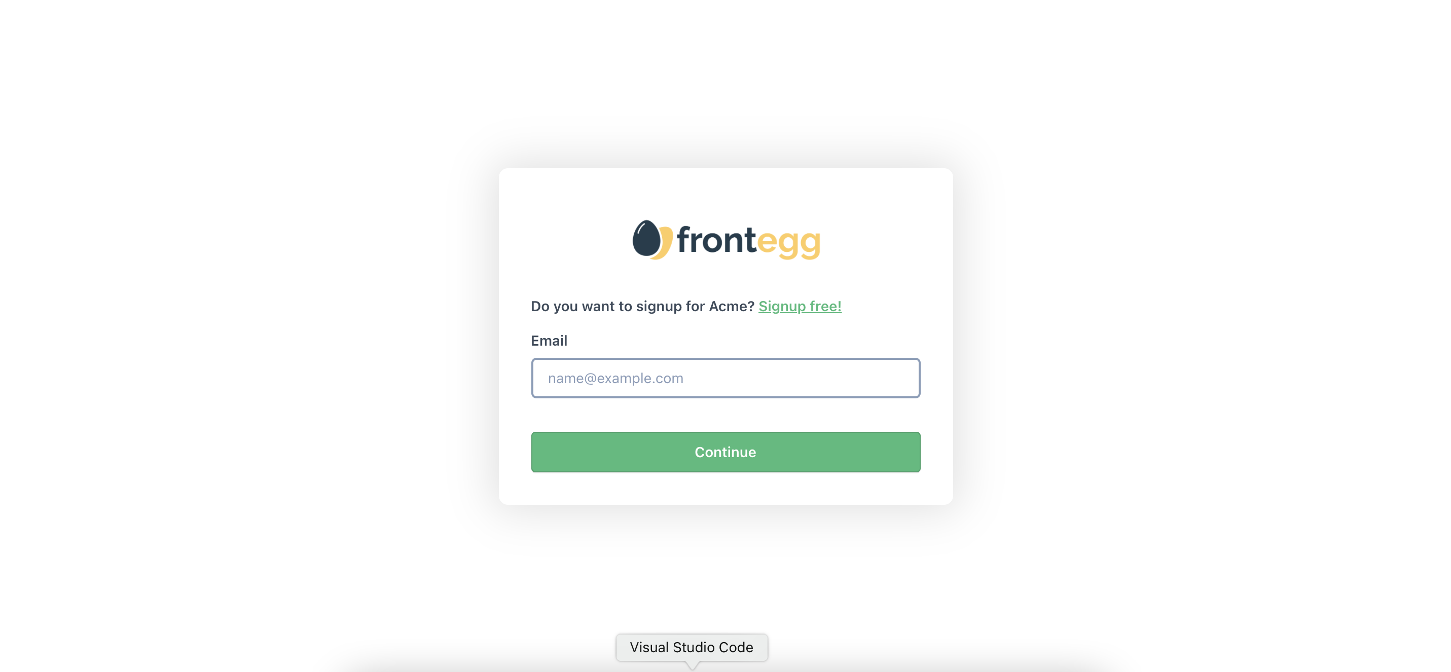
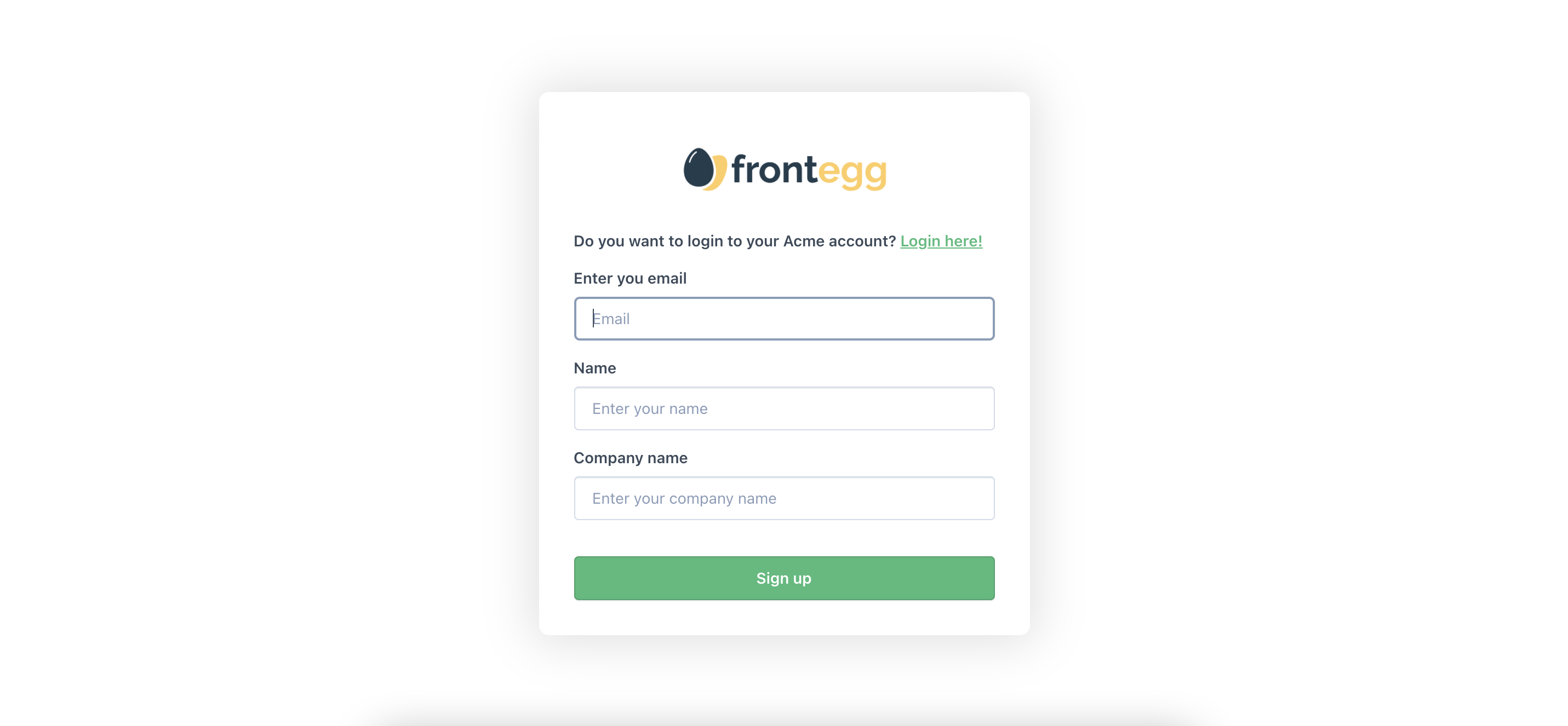
Set the text in your Login Box where it asks the user to change from the login page to the signup page and vice versa.
In the loginBox section of your localizations object, in the login section you can set custom text on the login page for the signup message and button. In the signup section, you can set custom text on the signup page for the login message and button.
Here is an example of label options with explanations:
const localizations = {
  en: {
    loginBox: {
      login: {
        /**
         * Go to signup message in Login page header
         */
        signUpMessage: "Do you want to signup for Acme? ",
        /**
         * Go to signup link button text in Login page header
         */
        signUpLink: "Signup free!",
      },
      signup: {
        /**
         * Go to login message in signup page header
         */
        loginMessage: "Do you want to login to your Acme account? ",
        /**
         * Go to login link button text in signup page header
         */
        loginLink: "Login here!",
      },
    },
  },
};
The code above
The code in the sample above is from
frontegg/types/Localizations/LoginBoxLocalizations/login.d.tsandfrontegg/types/Localizations/LoginBoxLocalizations/signup.d.ts.
Here is what the code above looks like on the login page:
Here is what the code above looks like on the signup page:
Input Placeholders
Set the text for your input placeholders in your Admin Portal and Login Box.
In the adminPortal and loginBox sections of your localizations object, you can set custom text for the input placeholders.
Here are just a few examples of customizing input placeholders with explanations:
const localizations = {
  en: {
    loginBox: {
      login: {
        /**
         * String displayed as placeholder when email field is empty
         */
        emailInputPlaceholder: "Your email for Acme login",
        /**
         * String displayed as placeholder when password field is empty
         */
        passwordInputPlaceholder: "Your Acme login password",
        /**
         * Recover Code input placeholder in MFA recovery section
         */
        enterRecoveryCode: "Acme Recovery Code",
        /**
         * Otc input placeholder
         */
        otcInputPlaceholder: "Acme OTC",
        /**
         * Force MFA section input placeholder
         */
        forceMfaInputPlaceholder: "MFA Input Acme",
      },
      signup: {
        /**
         * Signup name input placeholder
         */
        nameInputPlaceholder: "Your name for Acme account",
        /**
         * Signup email input placeholder
         */
        emailInputPlaceholder: "Your email for Acme login",
        /**
         * Signup password input placeholder
         */
        passwordInputPlaceholder: "A secure password for Acme login",
        /**
         * Signup company name input placeholder
         * this input is optional
         */
        companyNameInputPlaceholder: "Your company name with Acme",
      },
    },
  },
};
The code above
The code sample above is from files within
frontegg/types/Localizations/LoginBoxLocalizations/. Searching for the wordplaceholderin the files will help you find relevant properties.
Admin Portal Navigation
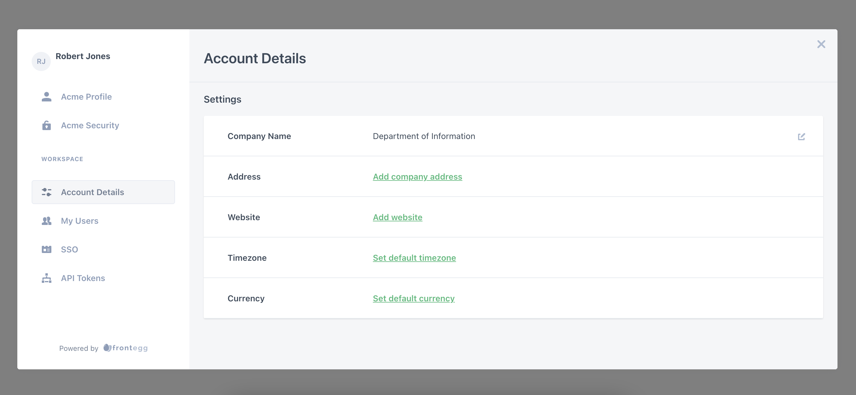
Customize the navigation text in your Admin Portal. By default, the navigation looks something like the left sidebar in the image below:

Change the text of the navigation items in the sidebar. Your options for customizing navigation text are in frontegg/types/Localizations/AdminPortalLocalizations/navigation.d.ts.
Here is an example that changes the text for Profile, Account Security, and Users:
const localizations = {
  en: {
    adminPortal: {
      navigation: {
        /**
         * Profile navigation item text
         */
        profile: "Acme Profile",
        /**
         * Privacy navigation item text
         */
        privacy: "Acme Security",
        /**
         * Users navigation item text
         */
        users: "My Users",
      },
    },
  },
};
Here is the result:
Admin Portal Subsections
Customize the text within the different subsections of your Admin Portal. For instance, customize the page or dialog title, column titles in tables, and more.
It is easy to find the options available for customizing text within each Admin Portal subsection.
Generally, each subsection has its own file in frontegg/types/Localizations/AdminPortalLocalizations/ with a filename that corresponds to the section name. For instance, find the Privacy & Security text settings in the privacy.js file and the Users text settings in the users.js file.
In each file is an object containing the name of the subsection key and the options available for customizing. In the adminPortal section of your localizations object, add the subsection key with an object containing your custom text.
For instance, on the Users page, you can customize the names of the labels in the users table. Here is a simple example.
Here are the default table titles on the Users page:
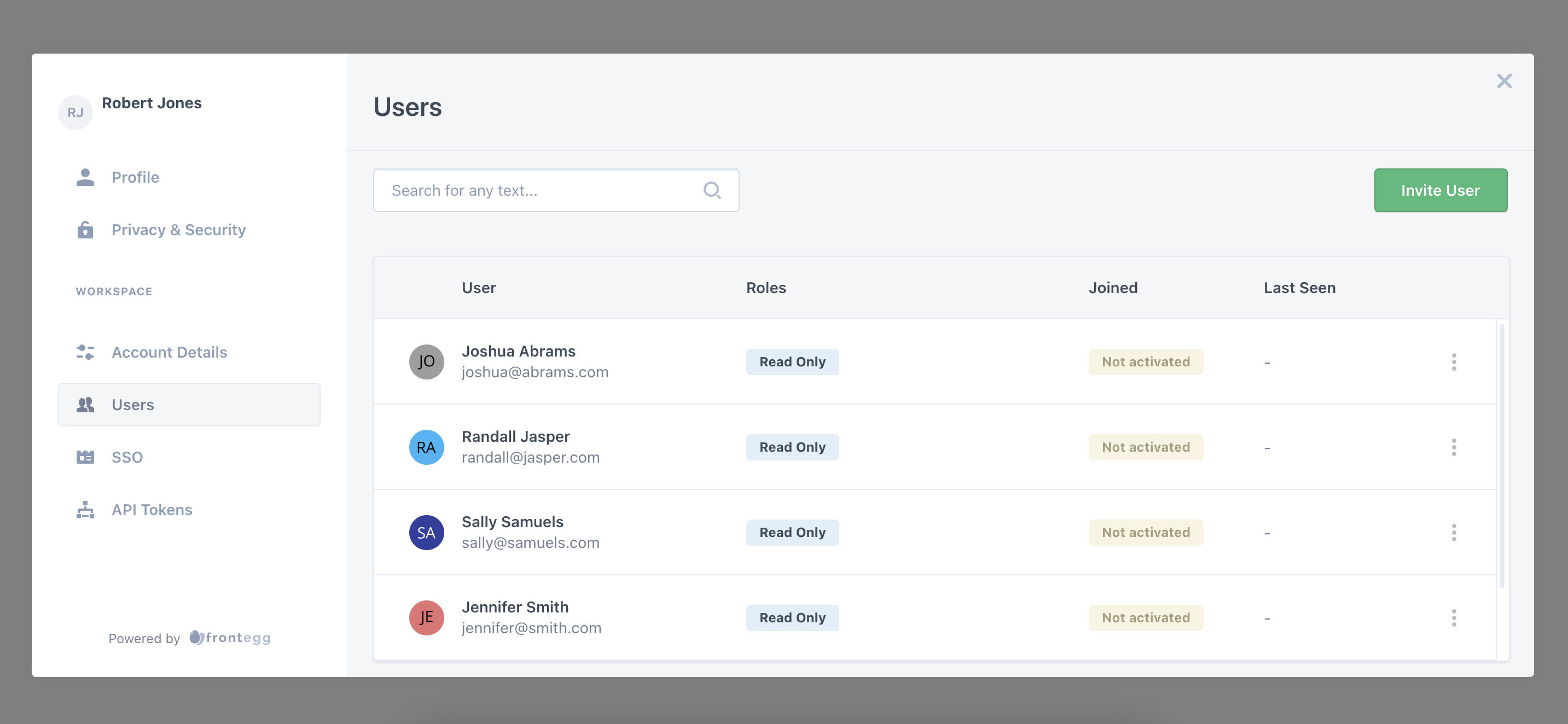
To change the titles in the table, here is sample code:
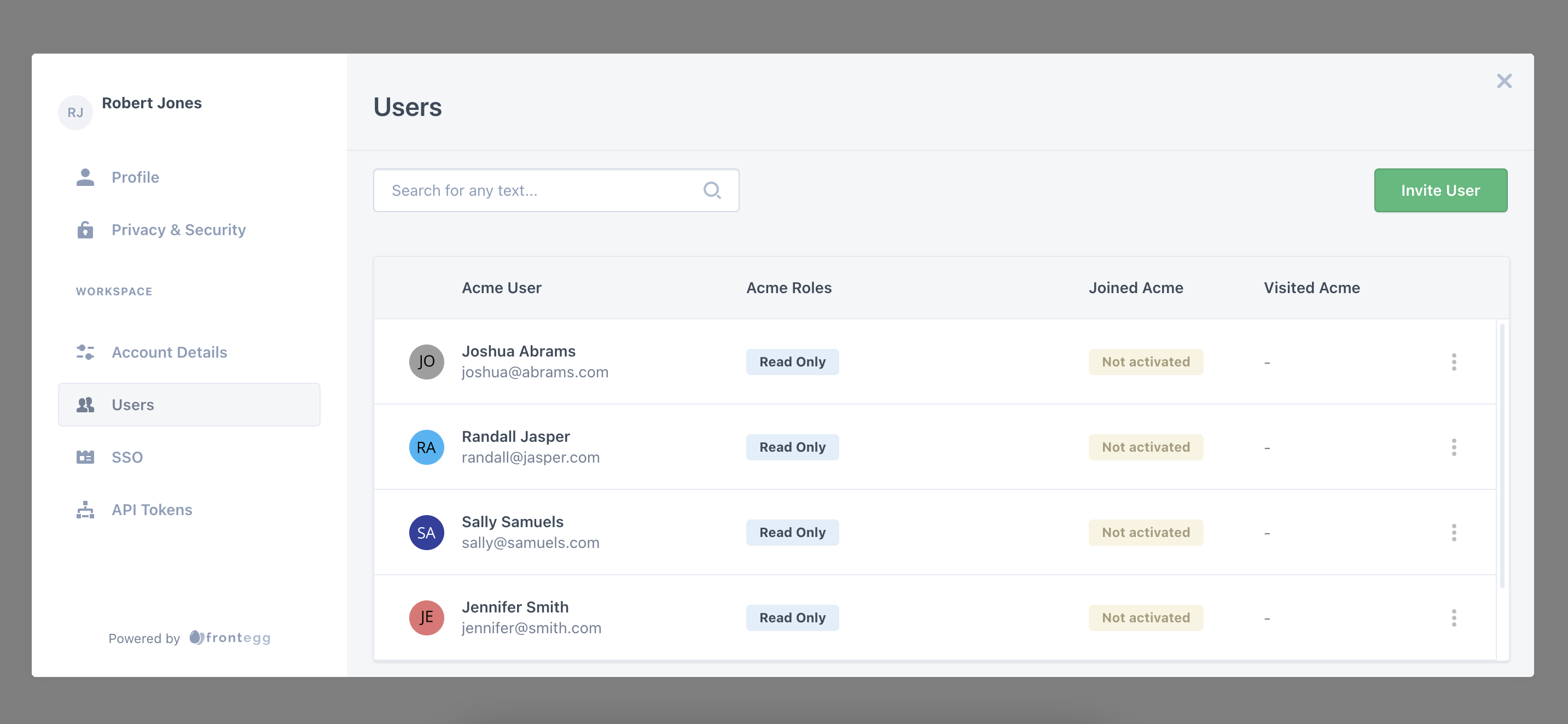
const localizations = {
  en: {
    adminPortal: {
      users: {
        userHeader: "Acme User",
        rolesHeader: "Acme Roles",
        joinedHeader: "Joined Acme",
        lastSeenHeader: "Visited Acme",
      },
    },
  },
};
The code above
The code sample above is from
frontegg/types/Localizations/AdminPortalLocalizations/users.d.ts. Review it to see what else you can customize about the Users page.
Here is the Admin Portal Users page with the table titles updated:
Updated 27 days ago