Customization
Frontegg offers multiple customization options to style and enhance your interface to suit your brand's style guidelines and business needs.
Interactive Styling Code Samples
We offer an extensive Sandbox environment for you to test Frontegg's various styling and customization options.
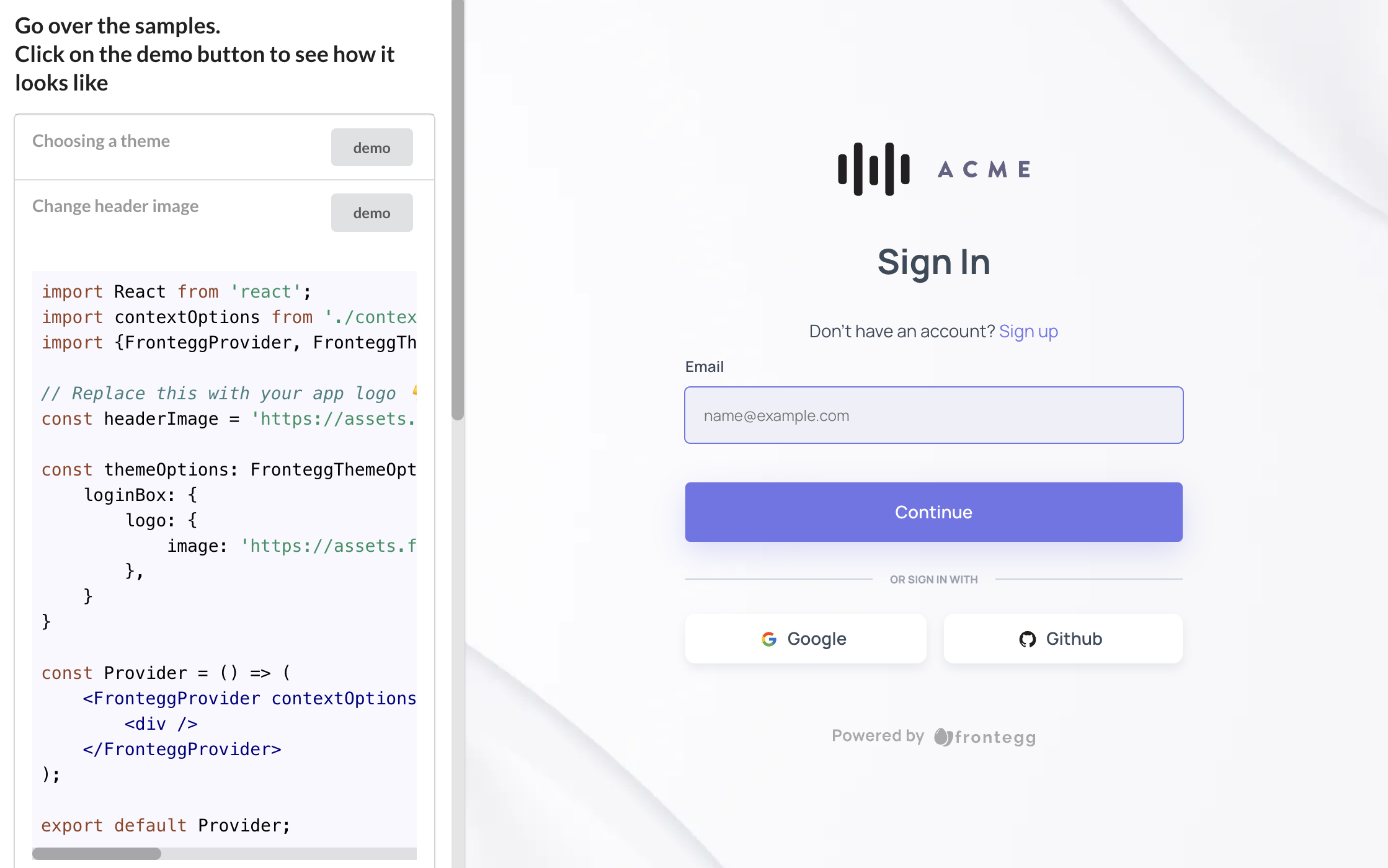
For more samples visit our interactive sandbox with more code samples!
Styling Architecture
To know what and how to style, it is important to understand that the Frontegg style architecture is a top-down tree where each level in the tree merges up.
The styles at any given level apply unless overridden by a conflicting style below it on the same branch.
The image below demonstrates this top-down approach.

The Frontegg style architecture defines some global customization styles that can be applied both on the login-box and admin portal as well as customization styles that you can apply on each and every one of them separately.
The idea is that you can always reach the level of customization you need within the granularity that your application requires.
This top-down approach makes it easy to customize components that share the same design regardless of where the component appears in your application. But it also allows for the precision you need for uniquely styling specific parts of your application.
The FronteggThemeOptions interface is the main interface that controls the entire customization of the Frontegg application.
export interface FronteggThemeOptions {
    palette?: ThemePaletteOptions;
    typographyStyleOptions?: CSSProperties;
    spacing?: SpacingOptions;
    shadows?: Shadows;
    transitions?: TransitionsOptions;
    breakpoints?: BreakpointsOptions;
    direction?: Direction;
    components?: ComponentsOptions;
    typography?: TypographyOptions;
    adminPortal?: AdminPortalThemeOptions;
    loginBox?: LoginBoxThemeOptions;
}
As shown in the snippet above, the top-most level is the global level. A style applied at the global level impacts all Frontegg components unless you explicitly override that style at a lower level.
Frontegg + Material-UI = 💚
Frontegg base components rely on the great Material UI (as we believe that wheels shouldn't be re-invented). Therefore, some of the links you see below will refer to the documentation of Material UI.
The customization options are split into the following (no worries, we will go deeper for each of the components when we slide along this guide).
| Attribute | Description |
|---|---|
palette | Color palette representing the main colors of the application |
typographyStyleOptions | Inline CSS representing the font options |
spacing | Styles for spacing options |
shadows | Styles for generic shadow configurations |
transitions | Defines generic behaviors for CSS transitions (how fast they go etc.) |
breakpoints | Defines breakpoints for different resolutions (CSS media like) |
direction | LeftToRight | RightToLeft |
components | Allows to override ALL of the material-ui components styles we are using such as: MuiAlert, MuiAutocomplete, MuiButton etc. |
typography | Defines which fonts to use and which fonts families |
loginBox | Customization options for the Login Box (more info here) |
adminPortal | Customization options for the Admin Portal (more info here) |
Code Integration and Structure
First, this guide shows you how to integrate the themeOptions object into your code. Then, it explains the structure of the themeOptions object so that you can customize your styles.
Integration
When integrating the Frontegg Provider, pass themeOptions as an initialization attribute. The value for themeOptions needs to be an object containing your custom styles.
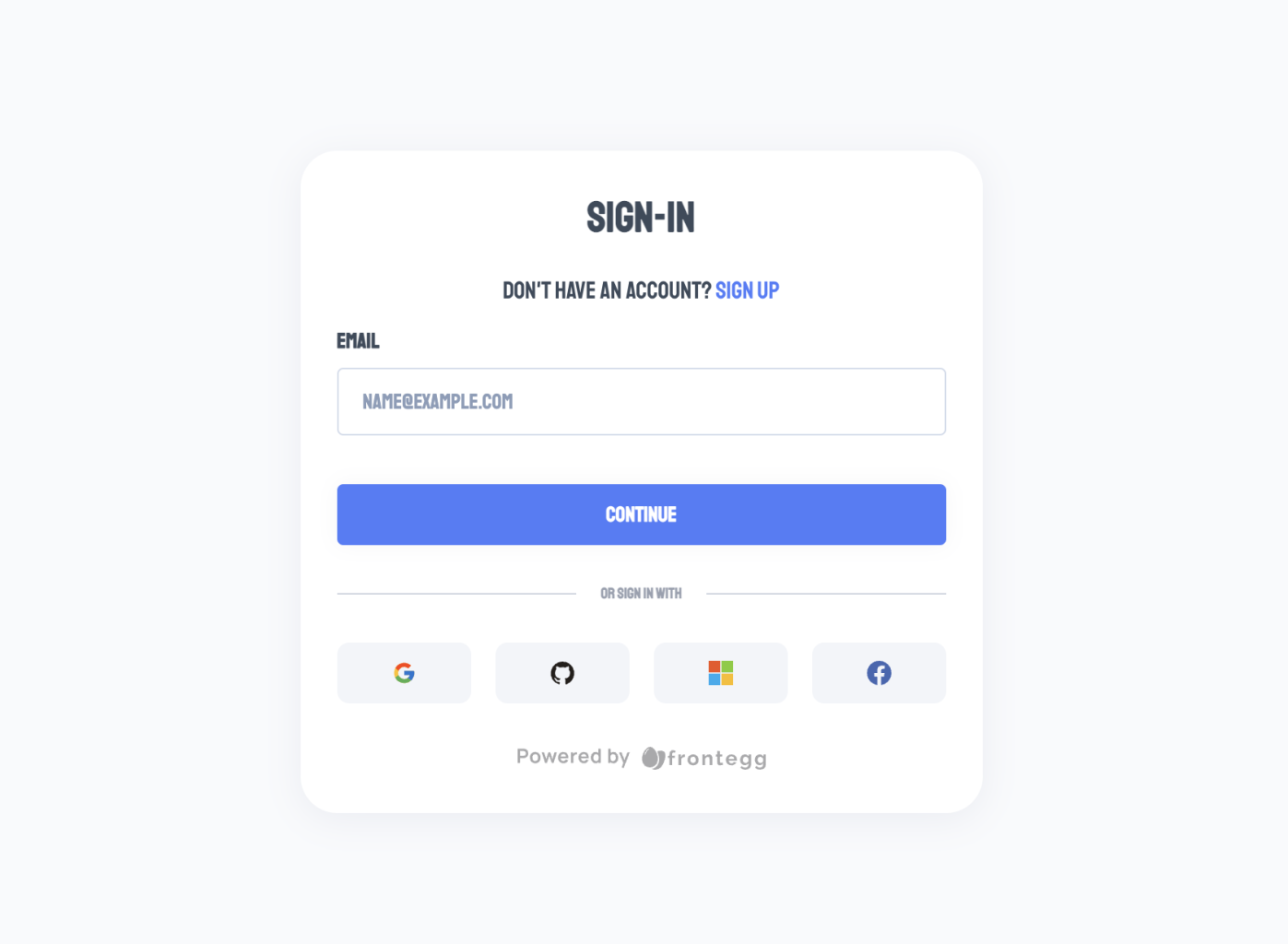
For example, here is a simple example that sets the fontFamily at the global level to monospace:
import { FronteggProvider } from "@frontegg/react";

const contextOptions = {
  baseUrl: "https://your-application.frontegg.com",
};

const themeOptions = {
   typographyStyleOptions: {
      fontFamily: 'staatliches',
  },
}

ReactDOM.render(
  <FronteggProvider
    contextOptions={contextOptions}
    themeOptions={themeOptions}
  >
    <App />
  </FronteggProvider>,
  document.getElementById("root")
);
The image below shows the result of this code example where the font in use is Monospace:
Master Object
Your themeOptions object can contain custom styles for all the available levels.
Here is an object containing all levels and their corresponding styling options.
const themeOptions = {
  // Global styles
  palette: ThemePalette;
  typographyStyleOptions: CSSProperties;
  spacing: Spacing;
  shadows: Shadows;
  transitions: Transitions;
  breakpoints: Breakpoints;
  direction: Direction;
  components: ComponentsOptions;
  typography: Typography;

  // Login Box styles
  loginBox: {
    // Easier way to load predefined themes
    themeName: 'classic' | 'modern' | 'vivid' | 'dark';
    // Specific customization options for the accept invitation page
    acceptInvitation: AcceptInvitationPageTheme;
    // Specific customization options for the activate account page
    activateAccount: ActivateAccountPageTheme;
    // Specific customization options for the forgot password page
    forgotPassword: ForgotPasswordPageTheme;
    // Specific customization options for the reset password page
    resetPassword: ResetPasswordPageTheme;
    // Specific customization options for the login page
    login: LoginPageTheme;
    // Specific customization options for the signup page
    signup: SignupPageTheme;
    // Specific customization options for the social logins section
    socialLogins: SocialLoginsTheme;
    // Specific customization options for the loader of the login box
    loader: LoaderTheme;
   },

   // Admin Portal styles
   adminPortal: {
     palette?: ThemePalette;
     typographyStyleOptions?: Partial<CSSProperties>;
     spacing?: SpacingOptions;
     shadows?: Shadows;
     transitions?: TransitionsOptions;
     breakpoints?: BreakpointsOptions;
     direction?: Direction;
     components?: ComponentsOptions;
     typography?: TypographyOptions;
     layout: {
       fullScreenMode: boolean;
     };
   }
};
You do not need this entire master object in your code. Instead, just include styles for properties where you want to override the default.
Types of Custom Styles
If you are using typescript, the interface for the style options is exposed and you can easily import it to see what options are available.
import { FronteggAppOptions } from '@frontegg/types';If you are not using typescript, look in the frontegg package for the
frontegg/typesfolder to see the style options.
Customization and Styling Through Code
Fully customize your Frontegg components to match your brand and business. In addition to the styling ease provided by our trailblazing builders, by making the customization interface open for you to write your own styles, text, and code flows, we also provide you complete styling and messaging control.
We understand from first-hand experience the level of granularity and control developers can accomplish writing their own code. Plus, why stop at style customizations when you can customize the text, too.
Advanced Styling and Customization
Our unique builder allows you to easily create, customize, and deploy login flows to your web and applications.
Enhance your brand with components that match your design preferences. Your login box's interface is designed via our Builder. You can choose from various login methods like SSO, Social, Password, or Passwordless.
Our builder streamlines the process, reducing development time and costs. You can focus on your core competencies while we handle login flow design and maintenance intricacies.
Within the Frontegg builder, you can modify two main products that we offer: the Login Box, and the Admin Portal - both designed for self-service.
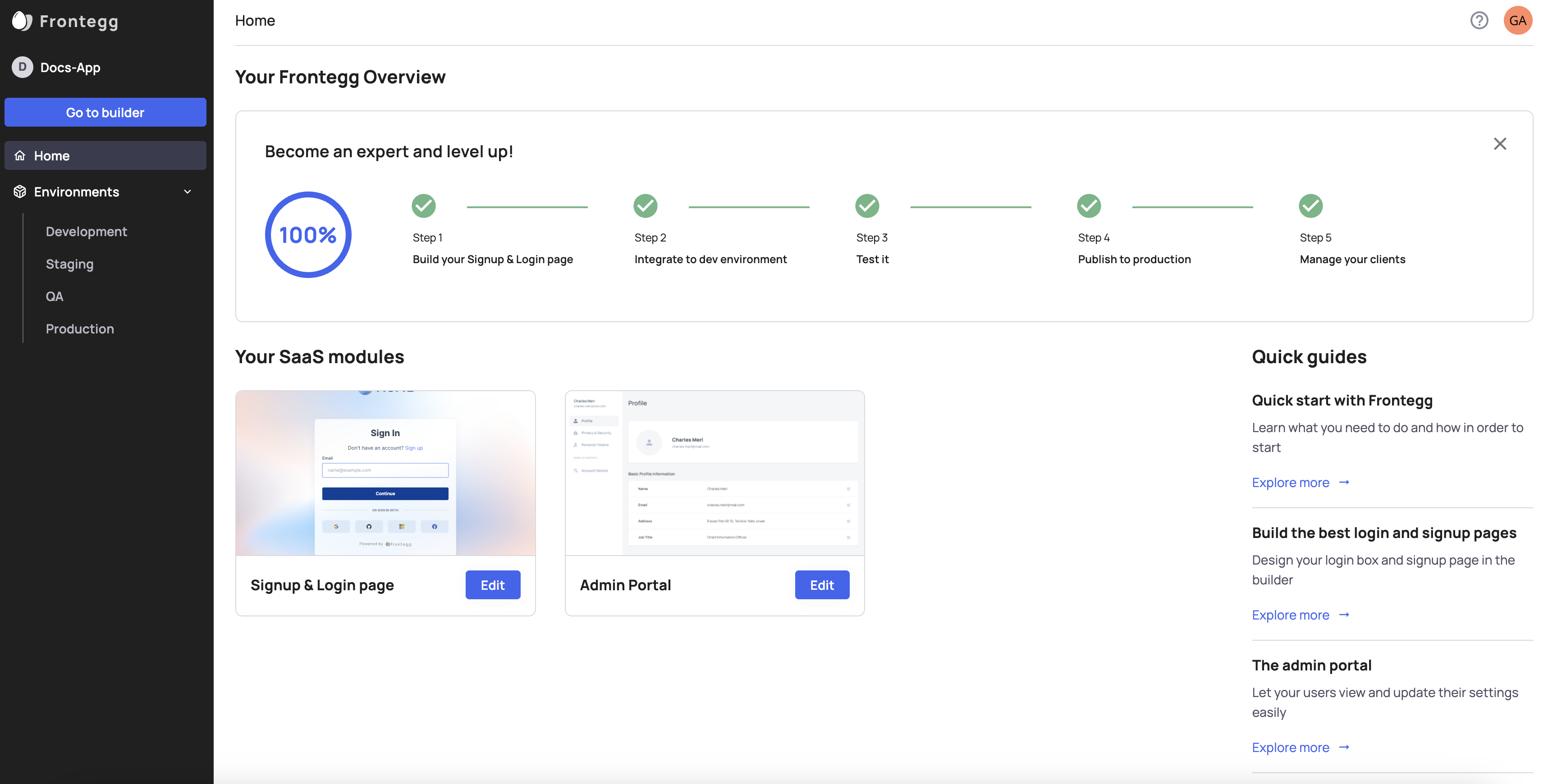
How to get to the Builder?
To get to the builder click Go to Builder from the Home page or any environment on the left panel.
Updated 2 months ago