Styling (old vs, need to see if to incorperate content into new vs. )
Limitations
The customizations described below can be implemented only for Embedded Login.
Frontegg offers one of the most powerful login-box builders in the market. It allows you to fully customize your login dialog flows. From the type of authentication you want to the security measurements and customization you need, the builder lets you do it all. You can even use the new no-code builder to fully customize your UI styling and branding. It supports all common uses cases. Watch the builder video to learn more.
Although you can implement most customizations using the builder, as developers providing tools for developers we know the level of granularity and control you can accomplish using code. Therefore, we completely opened the customization interface. Hence, you can fully control your brand and code flows by writing your own custom styles.
Endless opportunities exist. Check out the examples below and visit our interactive code sandbox.
GitHub code samples
⚡️ Visit our Frontegg Samples repository in GitHub ⚡️
Before reading this guide, it is essential you understand the style overview page. It explains the Frontegg style architecture, the base theme options, and how to pass themeOptions as an initialization attribute when you integrate the Frontegg Provider into your application.
Default Styling Examples
By default, the Frontegg login box has the modern theme and looks like this:
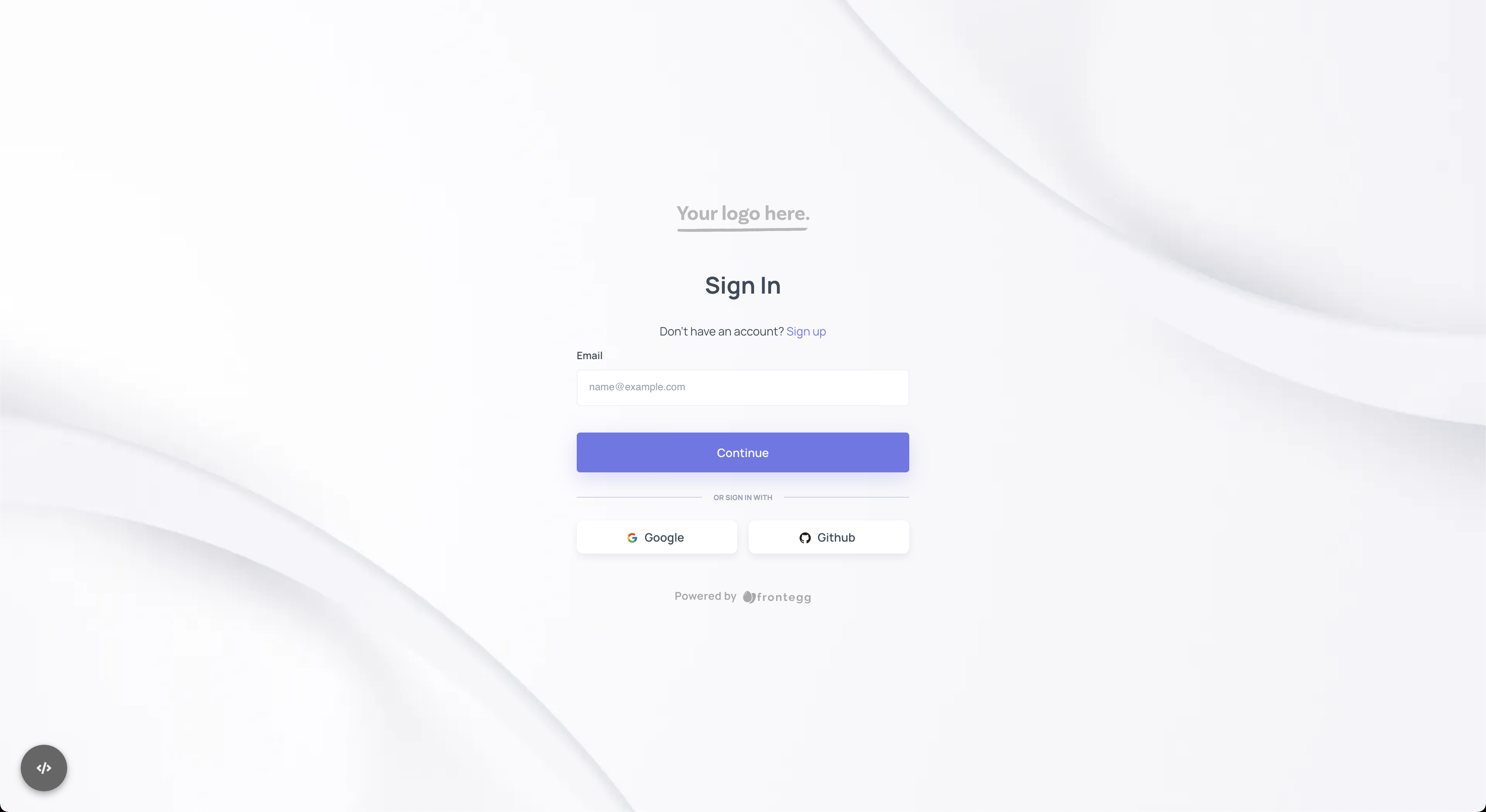
If you want to change the theme name programmatically, you can do it by passing the themeName option to the themeOptions property.
import React from "react";
import {FronteggProvider, FronteggThemeOptions} from "@frontegg/react";
import contextOptions from './context-options';

const themeOptions: FronteggThemeOptions = {
    loginBox: {
        themeName: 'classic',
    }
}

const Provider = () => (
    <FronteggProvider contextOptions={contextOptions} themeOptions={themeOptions}>
        <div />
    </FronteggProvider>
);

export default Provider;
In this case, choosing the classic theme overrides the default and results in the following:
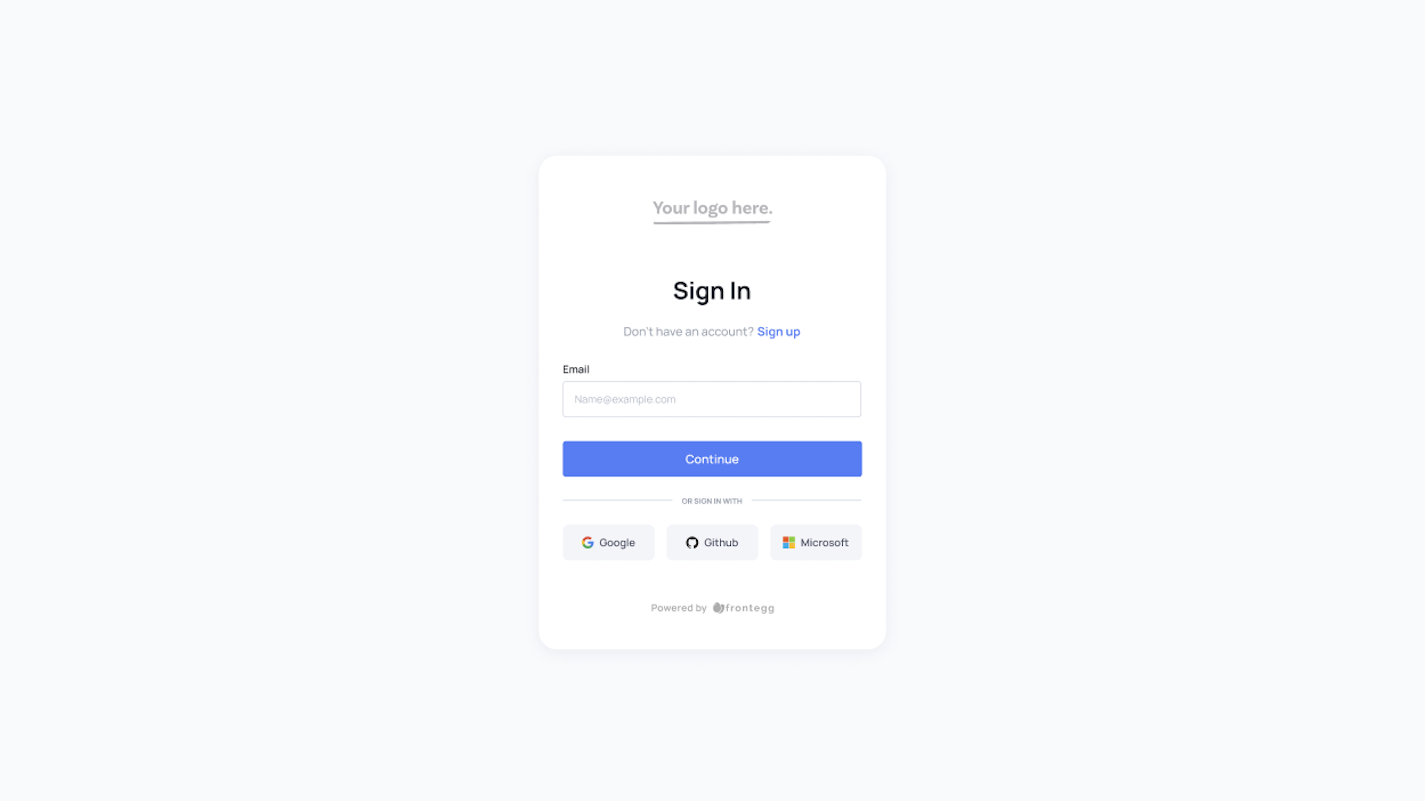
The theme names are modern, classic, vivid, and dark.
Changing the logo
Want change the Your Logo Here image? Well... we understand 😄
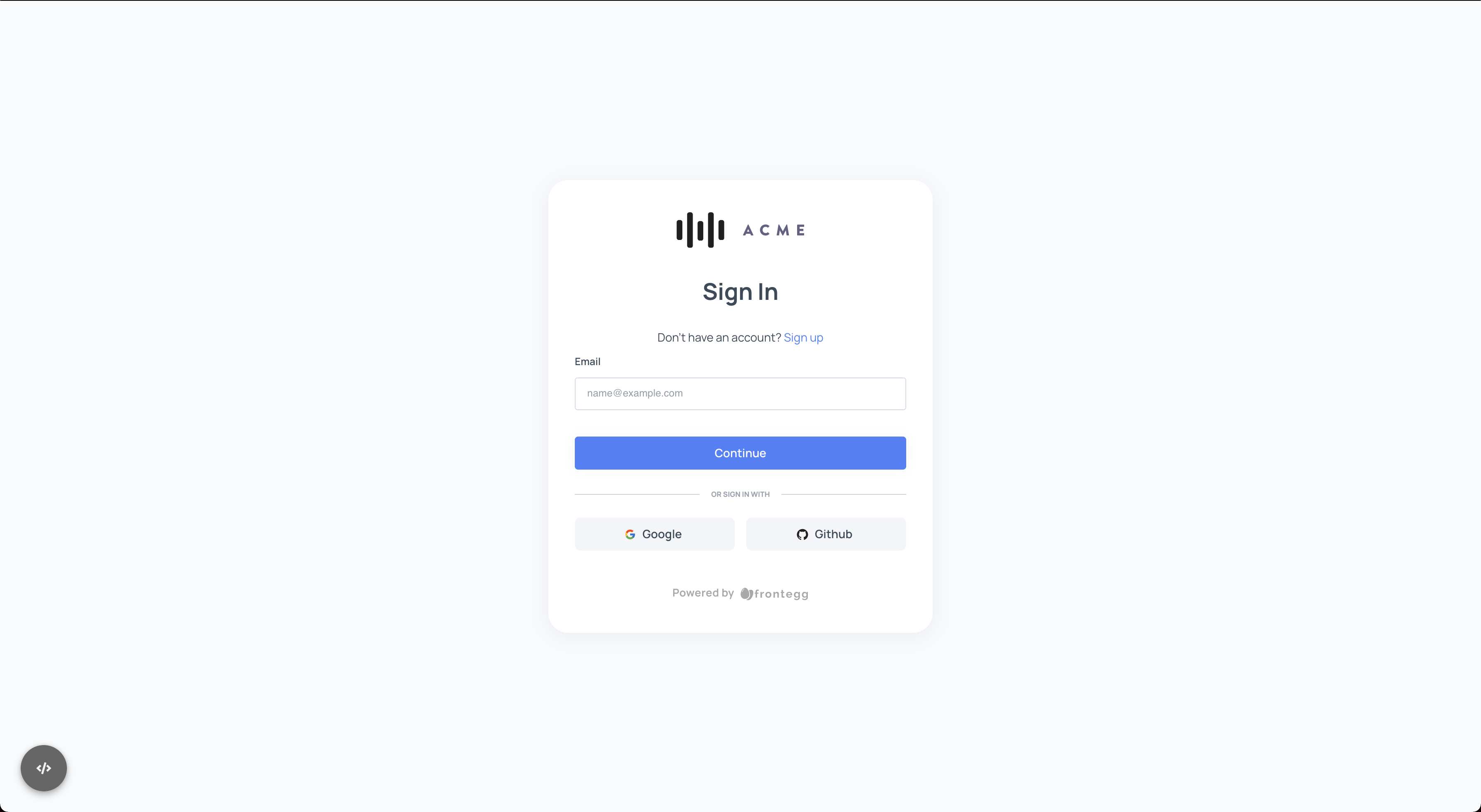
Changing the logo is available via the logo property on the themeOptions.
import React from 'react';
import contextOptions from './context-options';
import {FronteggProvider, FronteggThemeOptions} from '@frontegg/react';

// Replace this with your app logo 👇
const headerImage = 'https://assets.frontegg.com/public-frontegg-assets/acme-logo.svg';

const themeOptions: FronteggThemeOptions = {
    loginBox: {
        logo: {
            image: 'https://assets.frontegg.com/public-frontegg-assets/acme-logo.svg'
        },
    }
}

const Provider = () => (
    <FronteggProvider contextOptions={contextOptions} headerImage={headerImage} themeOptions={themeOptions}>
        <div />
    </FronteggProvider>
);

export default Provider;
Which results in the following:
Changing the browser title
Want to customize the titles of your application tabs in the browser?
Changing the title is available via the docTitle property.
//Available from the following frontegg versions:
//@frontegg/[email protected]
//@frontegg/[email protected]
//@frontegg/[email protected]
//@frontegg/[email protected]

import React from 'react';
import contextOptions from './context-options';
import {FronteggProvider, FronteggThemeOptions} from '@frontegg/react';

const themeOptions: FronteggThemeOptions = {
  loginBox: {
    login:{
      docTitle: 'Login browser title'
    },
    signup: {
      docTitle: 'Signup browser title'
    }
  }
}

const Provider = () => (
    <FronteggProvider contextOptions={contextOptions} themeOptions={themeOptions}>
        <div />
    </FronteggProvider>
);

export default Provider;
And it will result in the following:

Migrating from older versions?
If you are migrating from older versions, this replaces the
headerImageproperty used on theFronteggAppOptions.
Changing the background image
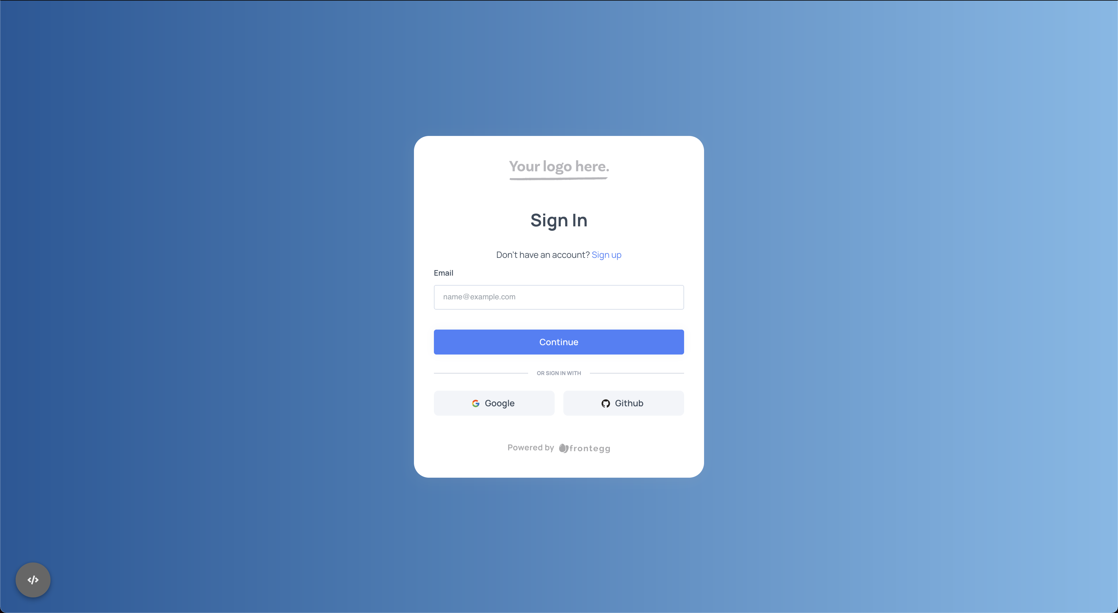
Changing the background image of the entire page is available by using the rootStyle attribute of the loginBox under the themeOptions as done below:
import React from "react";
import {FronteggProvider, FronteggThemeOptions} from "@frontegg/react";
import backgroundImage from '../assets/gradient';
import contextOptions from './context-options';

const themeOptions: FronteggThemeOptions = {
    loginBox: {
        rootStyle: {
            backgroundImage: backgroundImage
        },
    }
}

const Provider = () => (
    <FronteggProvider themeOptions={themeOptions} contextOptions={contextOptions}>
        <div />
    </FronteggProvider>
);

export default Provider;
Which results in the following:
Migrating from older versions?
If you are migrating from older versions, this replaces the
backgroundImageproperty used on theFronteggAppOptions.
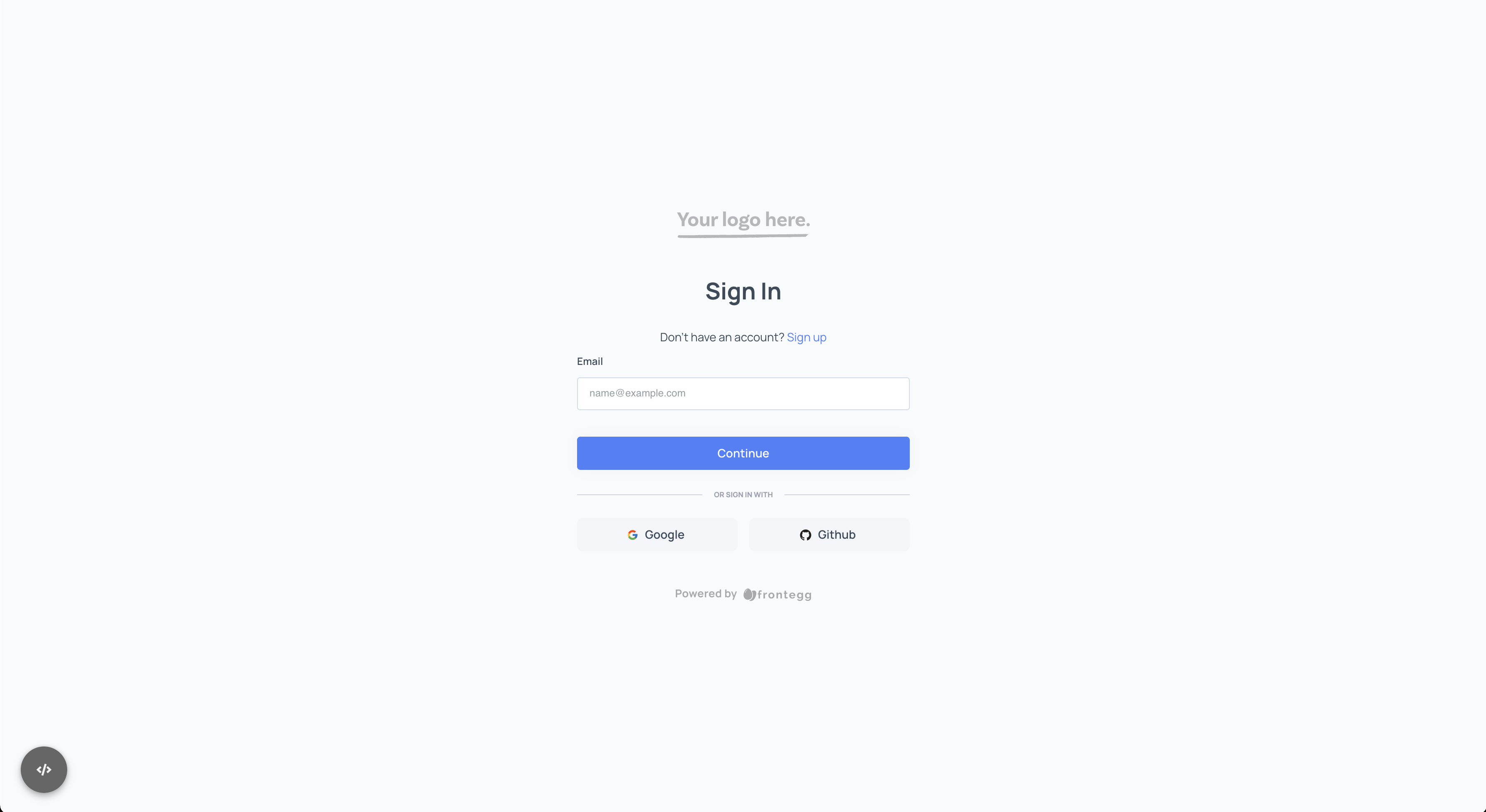
Flat design
In order to control the actual appearance of the box, you can change the boxStyle options under the loginBox attribute of the themeOptions as done below:
import React from "react";
import contextOptions from './context-options';
import {FronteggProvider, FronteggThemeOptions} from "@frontegg/react";

const themeOptions: FronteggThemeOptions = {
    loginBox: {
        boxStyle: {
            boxShadow: 'none',
            background: 'transparent'
        },
    }
}

const Provider = () => (
    <FronteggProvider contextOptions={contextOptions} themeOptions={themeOptions}>
        <div />
    </FronteggProvider>
);

export default Provider;
Which results the following:
Going Deeper With Examples
Having covered some of the basic common use cases of customization, it is a good time to start digging into the more complex use cases.
The loginBox attribute allows you to customize the appearance at the login-box level and provides additional flexibility on each of the internal routes and pages covered by it (such as activate account, forgot password, MFA etc.).
Here are some examples.
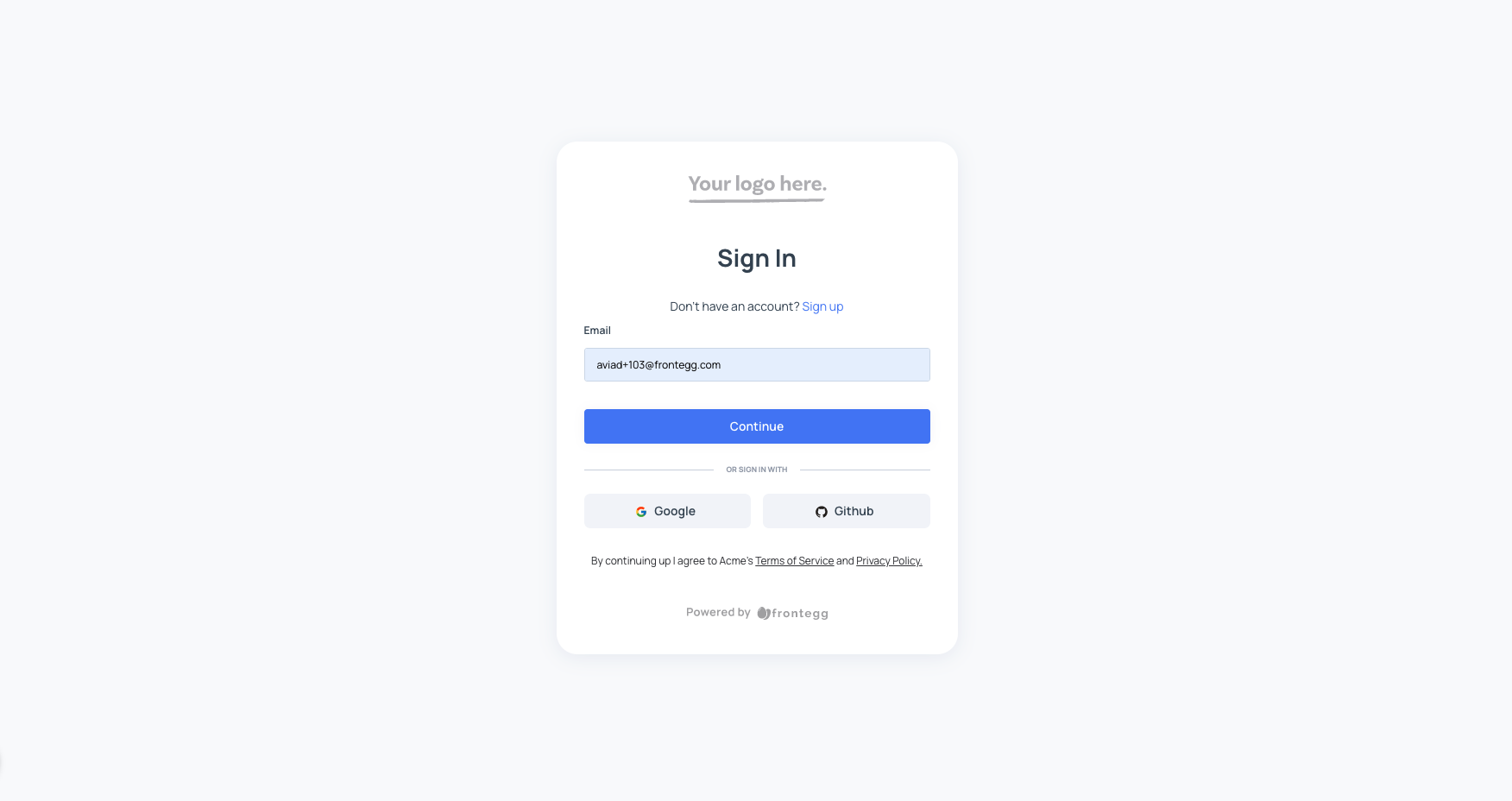
Adding footer to the login box
In some use cases, we want to add a footer that includes our terms of use and privacy policy.
Adding such a footer at the login-box level will cause the footer to appear on all of the login-box pages. Here is an example:
import React from "react";
import contextOptions from './context-options';
import {FronteggProvider, FronteggThemeOptions} from "@frontegg/react";

const themeOptions: FronteggThemeOptions = {
    loginBox: {
        boxFooter: () => {
            return (
                <div
                    style={{
                        textAlign: 'center',
                        marginTop: '30px',
                        fontSize: '12px',
                        lineHeight: '16px',
                        color: '#36373C',
                    }}>
                    By continuing up I agree to Acme's{' '}
                    <a
                        target='_blank'
                        rel='noopener noreferrer'
                        style={{ color: '#36373C' }}
                        href={'https://acme.com/terms'}>
                        Terms of Service
                    </a>{' '}
                    and{' '}
                    <a
                        target='_blank'
                        rel='noopener noreferrer'
                        style={{ color: '#36373C' }}
                        href={'https://acme.com/policy'}>
                        Privacy Policy.
                    </a>
                </div>
            )
        }
    }
}

const Provider = () => (
    <FronteggProvider contextOptions={contextOptions} themeOptions={themeOptions}>
        <div />
    </FronteggProvider>
);

export default Provider;
Which generates the following:
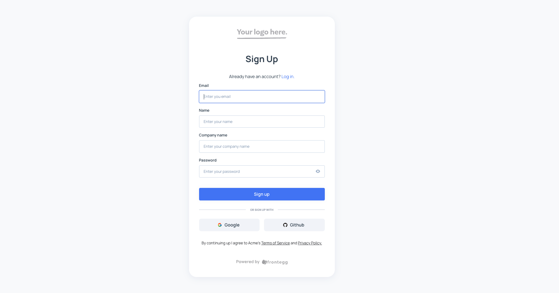
⚡️ The same footer can be applied only on the Signup page (or any of the others) by moving it to the nested page under the loginBox section under the themeOptions as done below:
import React from "react";
import contextOptions from './context-options';
import {FronteggProvider, FronteggThemeOptions} from "@frontegg/react";

const themeOptions: FronteggThemeOptions = {
    loginBox: {
        signup: {
            boxFooter: () => {
                return (
                    <div>
                        ...
                    </div>
                )
            }
        }
    }
}

const Provider = () => (
    <FronteggProvider contextOptions={contextOptions} themeOptions={themeOptions}>
        <div />
    </FronteggProvider>
);

export default Provider;
Which removes it from the Sign in page and adds it to the Sign up page:
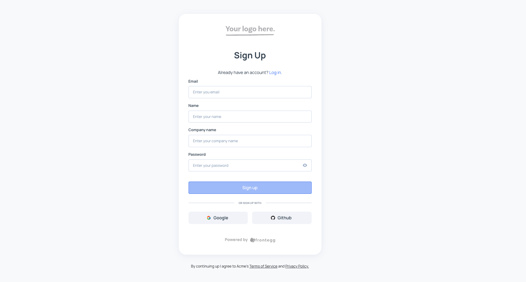
Additionally, you can place the footer outside of the login box (on the page) as done below:
import React from "react";
import contextOptions from './context-options';
import {FronteggProvider, FronteggThemeOptions} from "@frontegg/react";

const themeOptions: FronteggThemeOptions = {
    loginBox: {
        signup: {
            pageFooter: () => {
                return (
                    <div>
                        ...
                    </div>
                )
            }
        }
    }
}

const Provider = () => (
    <FronteggProvider contextOptions={contextOptions} themeOptions={themeOptions}>
        <div />
    </FronteggProvider>
);

export default Provider;
Which generates the following:
Split layout for the login box
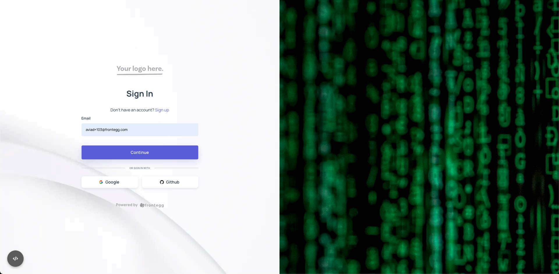
In some of the cases, you will choose to have the login and signup forms not in the center of the dialog, but split with some marketing or commercials messaging on the right of it.
The way to achieve it is via the layout property of the loginBox as the snippet below shows.
import React from "react";
import {FronteggProvider, FronteggThemeOptions} from "@frontegg/react";
import contextOptions from './context-options';

const themeOptions: FronteggThemeOptions = {
    loginBox: {
        layout: {
            type: 'float-left',
            splitSize: 50,
            sideElement: () => {
                return <div style={{width: '50%'}}>
                    <img src="https://images.unsplash.com/photo-1526374965328-7f61d4dc18c5?ixid=MnwxMjA3fDB8MHxwaG90by1wYWdlfHx8fGVufDB8fHx8&ixlib=rb-1.2.1&auto=format&fit=crop&w=2370&q=80"
                         alt="Hackers"/>
                </div>
            },
            sideElementStyle: {
                width: '50%'
            }
        }
    }
}

const Provider = () => (
    <FronteggProvider contextOptions={contextOptions} themeOptions={themeOptions}>
        <div />
    </FronteggProvider>
);

export default Provider;
Which results in the following:
Customizing the social login buttons
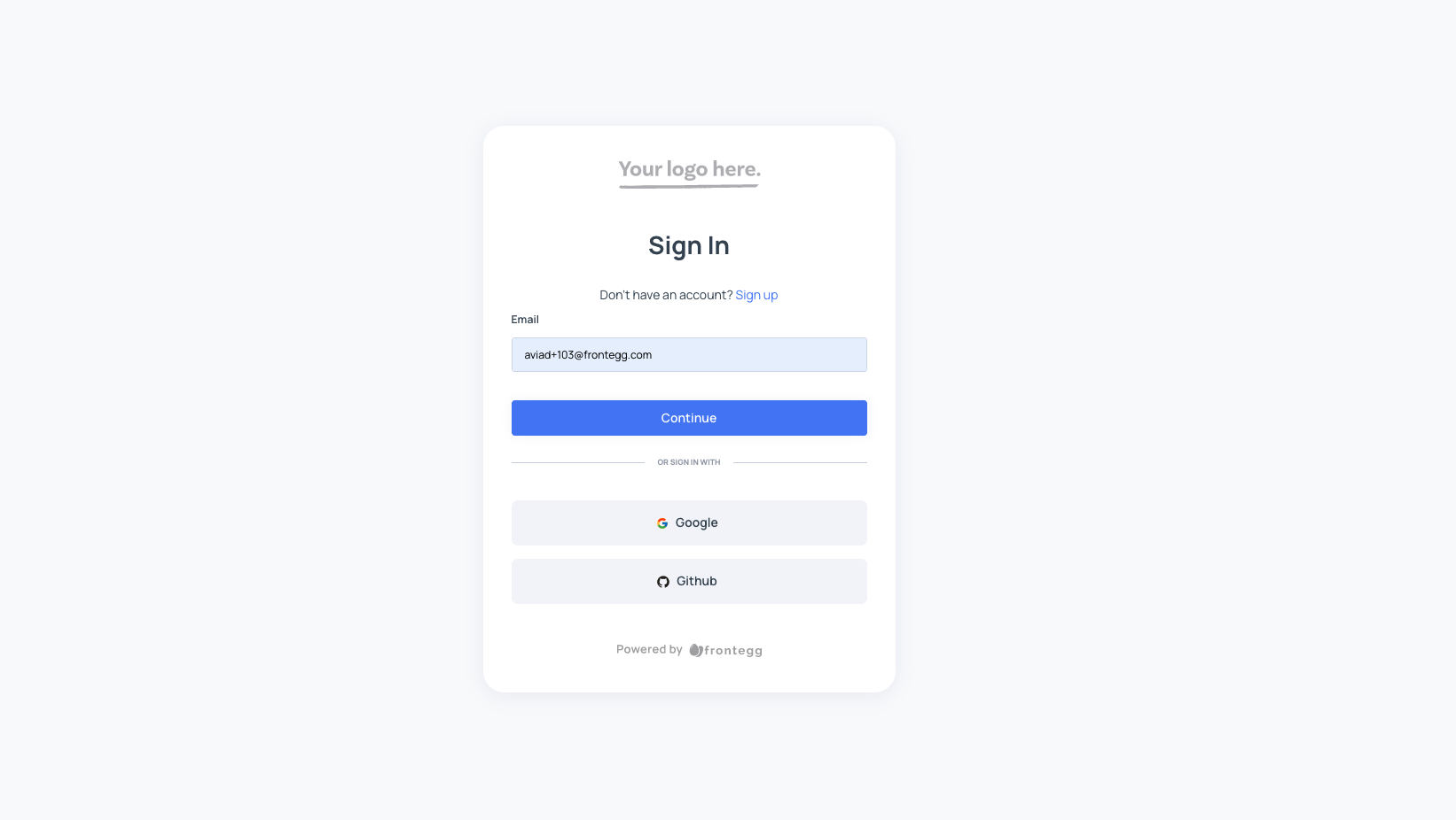
By default, the social login buttons are spread horizontally on the same row.
You can change the way that they are spread from a row flex mode to a column flex as done below:
import React from "react";
import {FronteggProvider, FronteggThemeOptions} from "@frontegg/react";
import contextOptions from './context-options';


const themeOptions: FronteggThemeOptions = {
    loginBox: {
        socialLogins: {
            containerStyle: {
                display: 'flex',
                flexDirection: 'column',
            },
            buttonStyle: {
                base: {
                    marginTop: '10px'
                }
            }
        },
    }
}

const Provider = () => (
    <FronteggProvider contextOptions={contextOptions} themeOptions={themeOptions}>
        <div />
    </FronteggProvider>
);

export default Provider;
Which orders the buttons like this:
Removing the text from the buttons
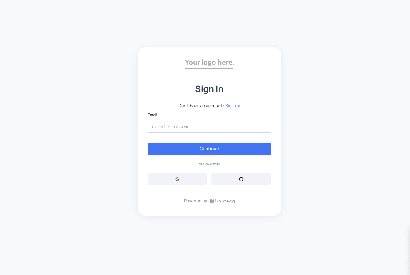
If you want to remove the text of the social login buttons and leave it with icons only, this is possible as well using the snippet below:
import React from "react";
import {FronteggProvider, FronteggThemeOptions} from "@frontegg/react";
import contextOptions from './context-options';

const themeOptions: FronteggThemeOptions = {
    loginBox: {
        socialLogins: {
            iconsOnly: true,
        },
    }
}

const Provider = () => (
    <FronteggProvider contextOptions={contextOptions} themeOptions={themeOptions}>
        <div />
    </FronteggProvider>
);

export default Provider;
Which looks like this:
Changing the colors of the social login buttons
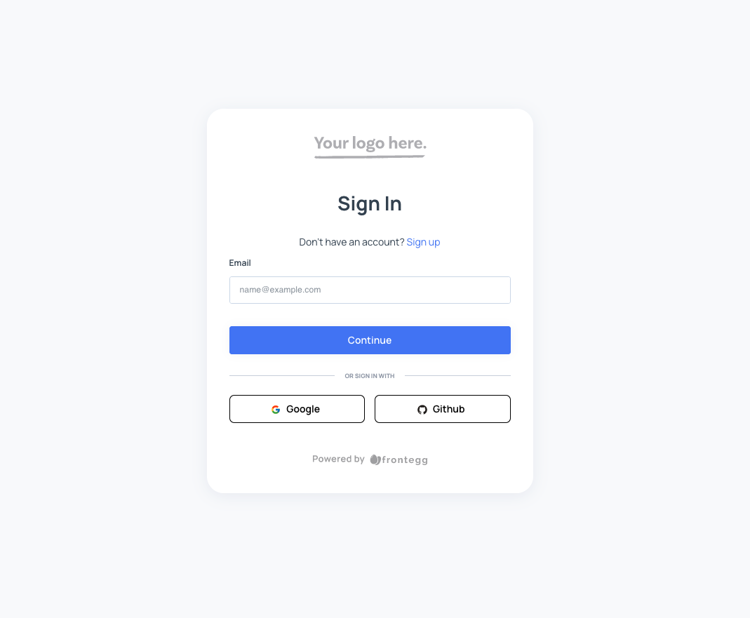
You can control the colors of the social login buttons by overriding the buttonStyle property on the socialLogins buttons section:
import React from "react";
import {FronteggProvider, FronteggThemeOptions} from "@frontegg/react";
import contextOptions from './context-options';

const themeOptions: FronteggThemeOptions = {
    loginBox: {
        socialLogins: {
            buttonStyle: {
                base: {
                    borderRadius: '0.5rem',
                    color: '#000',
                    background: '#fff',
                    border: '0.5px solid black'
                }
            },
        },
    }
}

const Provider = () => (
    <FronteggProvider contextOptions={contextOptions} themeOptions={themeOptions}>
        <div />
    </FronteggProvider>
);

export default Provider;
Which looks like this:
Controlling the social logins divider
You can change the text on the social logins divider by using the localizations option on the FronteggAppOptions:
import React from "react";
import contextOptions from './context-options';
import {FronteggProvider} from "@frontegg/react";
import {LocalizationsOverrides} from "@frontegg/types/Localizations";

const localizationsOverrides: LocalizationsOverrides = {
    en: {
        loginBox: {
            login: {
                signInWithSocialLogin: 'OR'
            }
        }
    }
}

const Provider = () => (
    <FronteggProvider localizations={localizationsOverrides} contextOptions={contextOptions}>
        <div />
    </FronteggProvider>
);

export default Provider;
In this example, instead of the OR SIGN IN WITH' text, there will be just OR`.
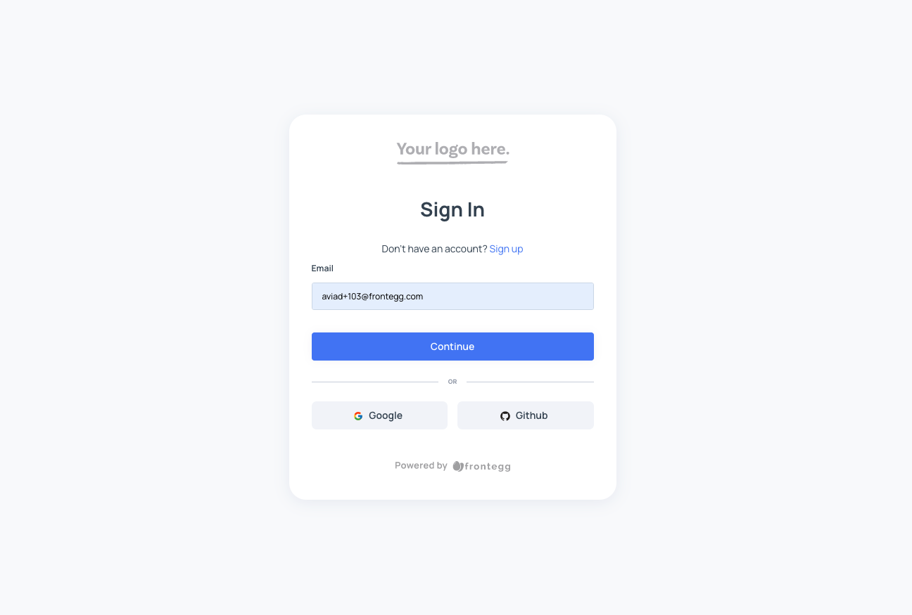
You can change the style of the divider using the dividerStyle attribute under the socialLogins property of the loginBox:
import React from "react";
import contextOptions from './context-options';
import {FronteggProvider, FronteggThemeOptions} from "@frontegg/react";
import {LocalizationsOverrides} from "@frontegg/types/Localizations";

const themeOptions: FronteggThemeOptions = {
    loginBox: {
        socialLogins: {
            dividerStyle: {
                backgroundColor: '#f5f5f5',
                borderColor: '#f5f5f5',
                borderWidth: '1px',
                borderStyle: 'solid',
                marginTop: '10px',
                marginBottom: '10px',
            }
        },
    }
}

const Provider = () => (
    <FronteggProvider themeOptions={themeOptions} contextOptions={contextOptions}>
        <div />
    </FronteggProvider>
);

export default Provider;
Which results the following:
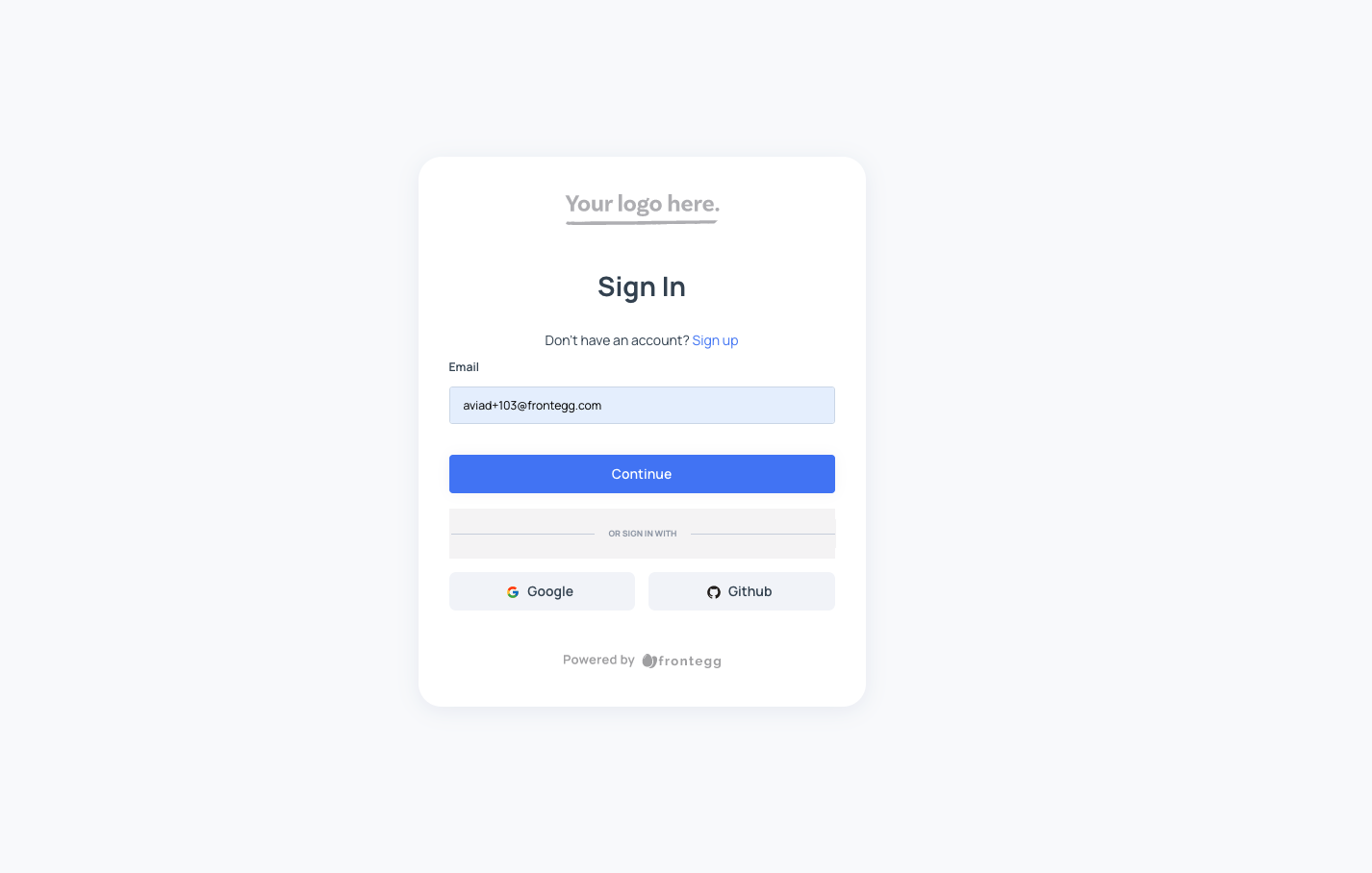
Not enough? Want to implement your own divider? We got you covered! 🚀
import React from "react";
import contextOptions from './context-options';
import {FronteggProvider, FronteggThemeOptions} from "@frontegg/react";

const themeOptions: FronteggThemeOptions = {
    loginBox: {
        socialLogins: {
            divider: () => {
                return <div>My super duper divider</div>
            },
        },
    }
}

const Provider = () => (
    <FronteggProvider contextOptions={contextOptions} themeOptions={themeOptions}>
        <div />
    </FronteggProvider>
);

export default Provider;
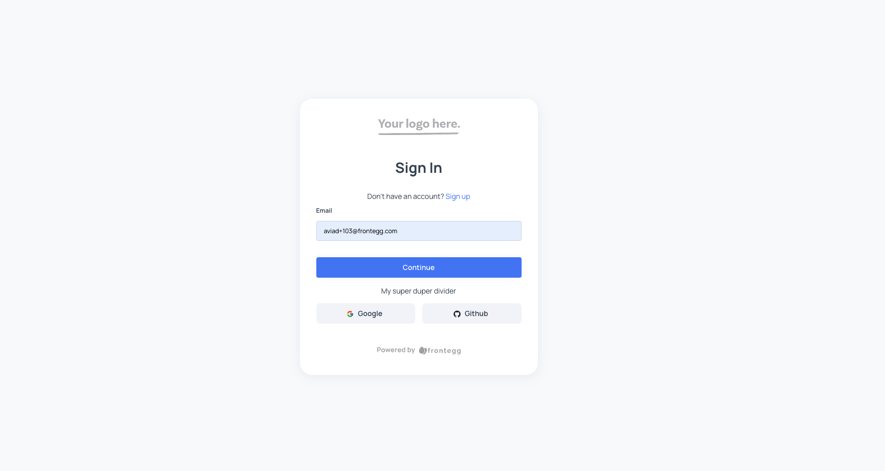
Customizing the inputs
Customizing the style of the inputs on the login box is available using the inputTheme under the loginBox section:
import React from "react";
import {FronteggProvider, FronteggThemeOptions} from "@frontegg/react";
import contextOptions from './context-options';

const themeOptions: FronteggThemeOptions = {
    loginBox: {
        inputTheme: {
            base: {
                backgroundColor: '#f5f5f5',
                borderColor: '#e5e5e5',
                color: '#333',
                borderRadius: '4px',
                borderWidth: '1px',
                borderStyle: 'solid',
                boxShadow: '0 0 0 1px rgba(0,0,0,.1)',
                fontSize: '14px',
                fontWeight: '400',
                height: '40px',
                padding: '0 15px',
                transition: 'border-color .2s ease-in-out, box-shadow .2s ease-in-out',
            },
        }
    }
}
const Provider = () => (
    <FronteggProvider contextOptions={contextOptions} themeOptions={themeOptions}>
        <div />
    </FronteggProvider>
);

export default Provider;
Which looks like this:
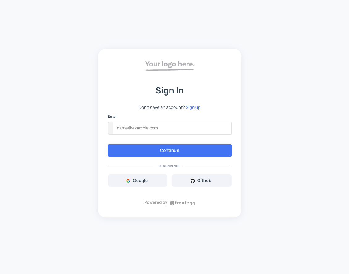
Customizing the links
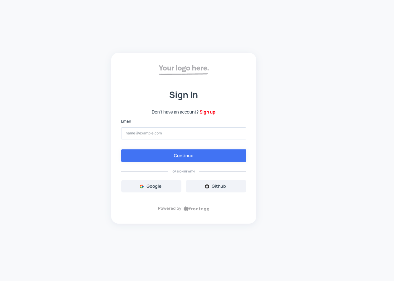
The links (such as the Don't have an account? Sign up) on the login box can be customized as well:
import React from "react";
import {FronteggProvider, FronteggThemeOptions} from "@frontegg/react";
import contextOptions from './context-options';

const themeOptions: FronteggThemeOptions = {
    loginBox: {
        linkButtonTheme: {
            base: {
                color: 'red',
                textDecoration: 'underline',
                fontWeight: 'bold',
            }
        },
    }
}
const Provider = () => (
    <FronteggProvider contextOptions={contextOptions} themeOptions={themeOptions}>
        <div />
    </FronteggProvider>
);

export default Provider;
Which looks like this:
Customizing the submit button
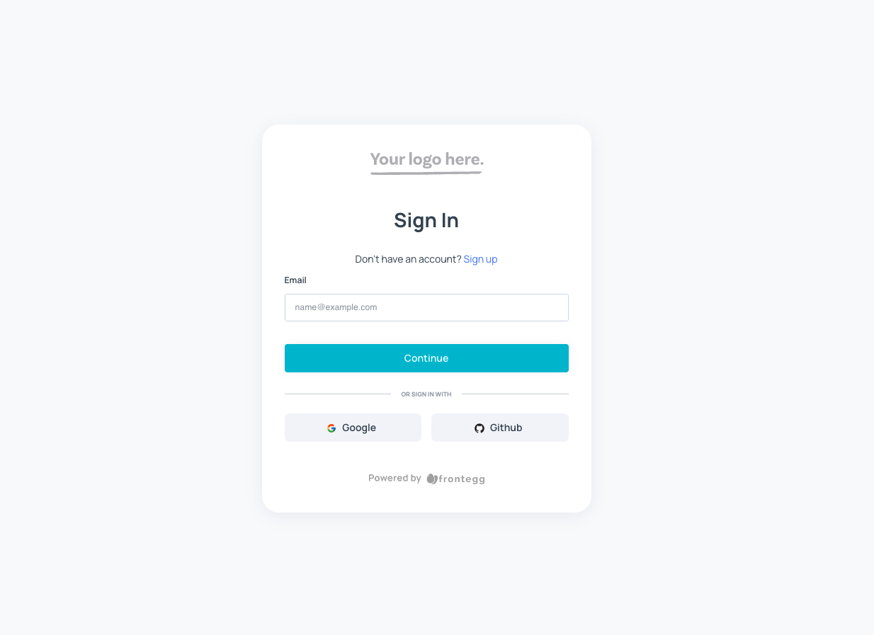
The submit (login) button can be customized using the snippet below:
import React from "react";
import {FronteggProvider, FronteggThemeOptions} from "@frontegg/react";
import contextOptions from './context-options';

const themeOptions: FronteggThemeOptions = {
    loginBox: {
        submitButtonTheme: {
            base: {
                backgroundColor: '#00bcd4',
                color: '#fff',
                borderColor: 'transparent'
            }
        }
    }
}
const Provider = () => (
    <FronteggProvider contextOptions={contextOptions} themeOptions={themeOptions}>
        <div />
    </FronteggProvider>
);

export default Provider;
Which looks like this:
Changing the input errors
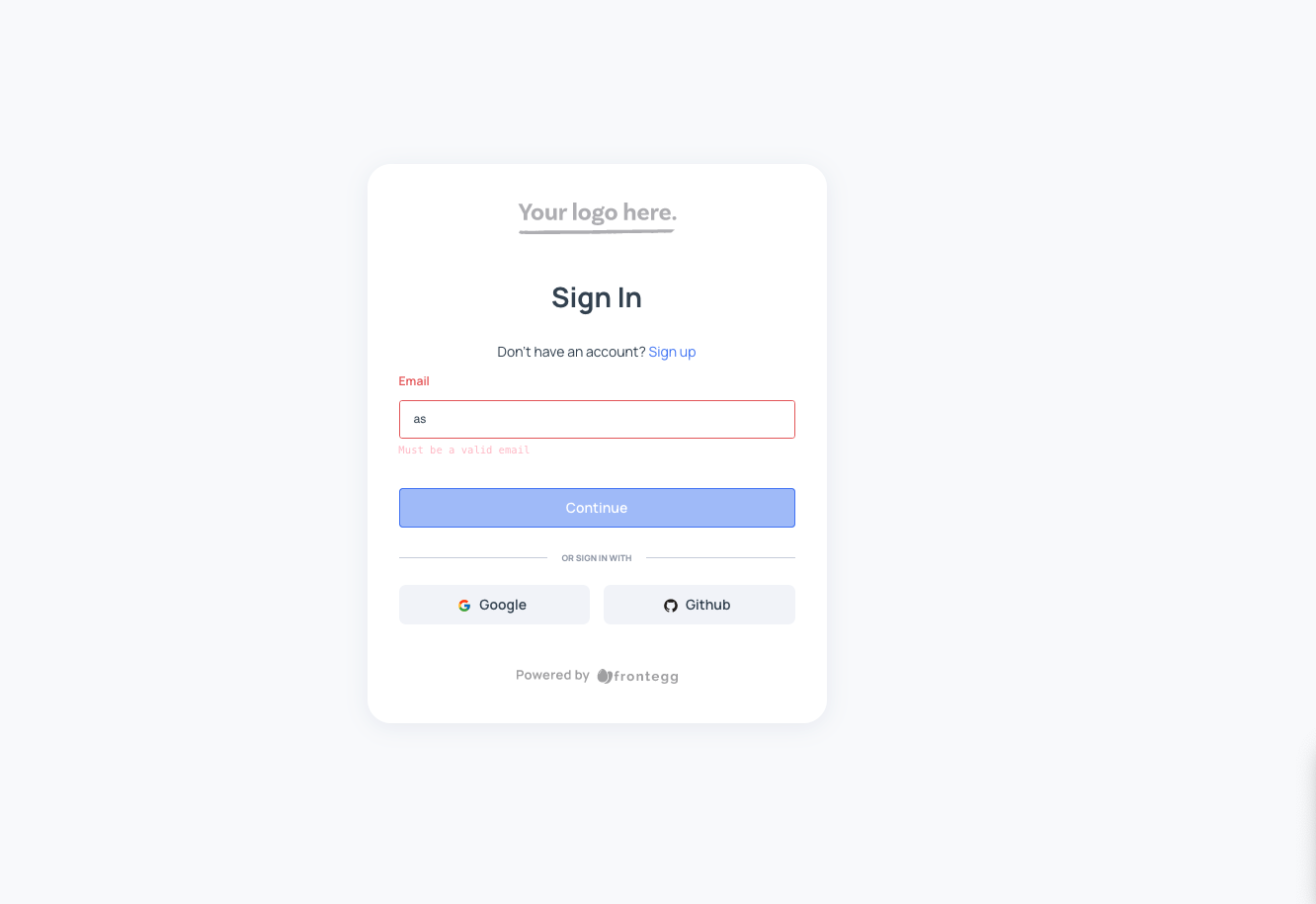
Style the inputs and labels for the error messages in your forms. For instance, change the color and font family. Here is sample code that changes the color to pink and fontFamily to monospace for the input error alerts:
import React from "react";
import {FronteggProvider, FronteggThemeOptions} from "@frontegg/react";
import contextOptions from './context-options';

const themeOptions: FronteggThemeOptions = {
    components: {
        MuiFormHelperText: {
            styleOverrides: {
                root: {
                    "&.Mui-error": {
                        color: "pink",
                        fontFamily: "monospace",
                    },
                },
            },
        },
    }
}
const Provider = () => (
    <FronteggProvider contextOptions={contextOptions} themeOptions={themeOptions}>
        <div />
    </FronteggProvider>
);

export default Provider;
Which looks like this:
Customizing the loader
The loader we display when loading the login box can be customized as well. You actually can implement your own loader and get the loading hook from the application provider in order to know when to display it. Just as shown in the snippet below. In this example, we utilized a loader element from semantic-ui):
import React, {useState} from "react";
import {FronteggProvider} from "@frontegg/react";
import {Dimmer, Loader} from "semantic-ui-react";

import contextOptions from './context-options';

// Replace this with your app logo 👇
const headerImage = 'https://assets.frontegg.com/public-frontegg-assets/acme-logo.svg';

const MyCustomLoaderComponent = () => {
    return (
        <Dimmer active>
            <Loader>Loading using custom loader!</Loader>
        </Dimmer>
    )
}
const Provider = () => {
    const [loading, setLoading] = useState(true);

    return (
        <div>
            <FronteggProvider customLoader={setLoading} contextOptions={contextOptions} headerImage={headerImage}>
                <div />
            </FronteggProvider>
            {loading && <MyCustomLoaderComponent />}
        </div>
    )
};

export default Provider;
Which looks like this:
Updated 2 months ago