Customization

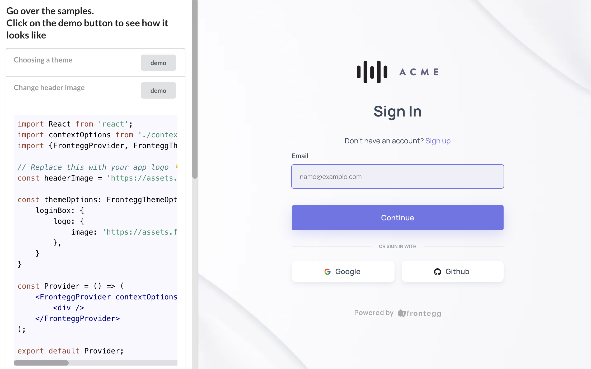
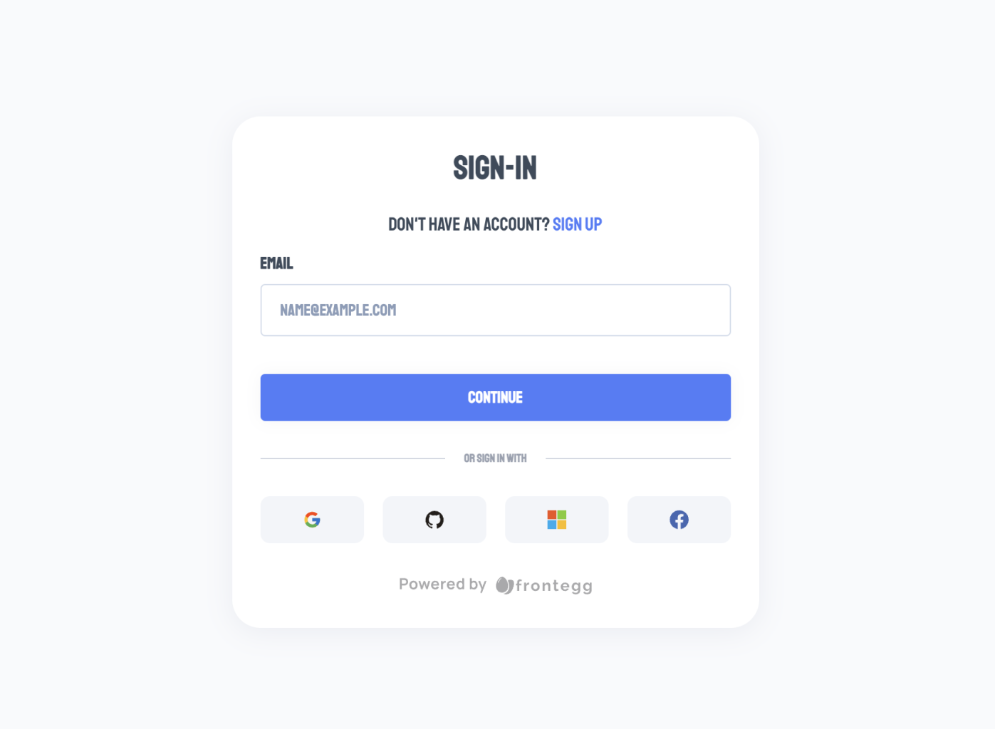
Frontegg offers multiple customization options to style and enhance your interface to suit your brand's style guidelines and business needs. You can customize your Admin Portal, Login box, and text component (localizations). This topic will give you a general overview of the tree-like architecture of customization in Frontegg through code. Once you have the basics, the sky's the limit in terms of what you can customize.
General Attributes
The customization options are split into various attributes that apply to both the Hosted and Embedded Modes and reflect the various customization options (style, configuration, and localization) we've mentioned previously.
| Attribute | Description | Usage |
|---|---|---|
integrations | Controls the visibility of all integrations | Admin Portal |
configuration | Controls the visibility and enablements of your portal configurations | Admin Portal |
navigation | Controls the visibility of all admin portal components, e.g., SSO, Roles, Groups, etc. hidden, visible, byPermission | Admin Portal |
theme | Login box styling options. | Login Box |
localizations | Styles for generic shadow configurations | Admin Portal + Login Box |
transitions | Defines generic behaviors for CSS transitions | |
breakpoints | Defines breakpoints for different resolutions (CSS media like) | |
direction | LeftToRight | RightToLeft | |
components | Allows to override ALL of the material-ui components styles we are using such as: MuiAlert, MuiAutocomplete, MuiButton etc. | |
loginBox | Customization options for the Login Box (more info here) | |
adminPortal | Customization options for the Admin Portal (more info here) | |
typography | Defines which fonts to use and which fonts families |
You can customize multiple aspects of your Frontegg default styles and texts either by passing these via themeOptions for customizing styles or using localizations for modifying or translating texts.
Styling Architecture
To know what and how to style, it is important to understand that the Frontegg style architecture is a top-down tree where the levels are merged-up.
The styles at any given level apply unless overridden by a conflicting style below within the same branch.
The image below demonstrates this top-down approach.

The Frontegg style architecture defines some global customization styles that can be applied both for your login-box and admin portal, as well as customization styles that you can apply for each separately.
The idea is that you can always reach the level of customization you need within the granularity that your application requires.
This top-down approach makes it easy to customize components that share the same design regardless of where the component appears in your application. But it also allows for the precision you need for uniquely styling specific parts of your application.
As shown in the snippet above, the topmost level is the global level. A style applied at the global level impacts all Frontegg components unless you explicitly override that style at a lower level.
Frontegg + Material-UI = 💚
Frontegg base components rely on the great Material UI (as we believe that wheels shouldn't be re-invented). Therefore, some of the links you see below will refer to the documentation of Material UI.
Interactive Styling Code Samples
We offer an extensive Sandbox environment for your usage, so you can test Frontegg's various styling and customization options.
For more samples visit our interactive sandbox with more code samples!
themeOptions Object
themeOptions ObjectYour themeOptions object can contain custom styles for all the available levels.
Here is an object containing all levels and their corresponding styling options.
const themeOptions = {
  // Global styles
  palette: ThemePalette;
  typographyStyleOptions: CSSProperties;
  spacing: Spacing;
  shadows: Shadows;
  transitions: Transitions;
  breakpoints: Breakpoints;
  direction: Direction;
  components: ComponentsOptions;
  typography: Typography;

  // Login Box styles
  loginBox: {
    // Easier way to load predefined themes
    themeName: 'classic' | 'modern' | 'vivid' | 'dark';
    // Specific customization options for the accept invitation page
    acceptInvitation: AcceptInvitationPageTheme;
    // Specific customization options for the activate account page
    activateAccount: ActivateAccountPageTheme;
    // Specific customization options for the forgot password page
    forgotPassword: ForgotPasswordPageTheme;
    // Specific customization options for the reset password page
    resetPassword: ResetPasswordPageTheme;
    // Specific customization options for the login page
    login: LoginPageTheme;
    // Specific customization options for the signup page
    signup: SignupPageTheme;
    // Specific customization options for the social logins section
    socialLogins: SocialLoginsTheme;
    // Specific customization options for the loader of the login box
    loader: LoaderTheme;
   },

   // Admin Portal styles
   adminPortal: {
     palette?: ThemePalette;
     typographyStyleOptions?: Partial<CSSProperties>;
     spacing?: SpacingOptions;
     shadows?: Shadows;
     transitions?: TransitionsOptions;
     breakpoints?: BreakpointsOptions;
     direction?: Direction;
     components?: ComponentsOptions;
     typography?: TypographyOptions;
     layout: {
       fullScreenMode: boolean;
     };
   }
};
You do not need this entire master object in your code. Instead, just include styles for properties where you want to override the default.
Types of Custom Styles
If you are using typescript, the interface for the style options is exposed and you can easily import it to see what options are available.
import { FronteggAppOptions } from '@frontegg/types';If you are not using typescript, look in the frontegg package for the
frontegg/typesfolder to see the style options.
Localizations Architecture
Thelocalizations initiation attribute, you can customize the text that appears in your Frontegg components— you can set custom button text, add custom input placeholders, write your own input labels, display custom error messages, and more. Similar to the other styling customization in Frontegg, the localization object adheres to the styling structure of our top-down approach.
localizations object
localizations objectThe localizations object is structured in a way that the outermost layer includes the key indicating the language. For example, for English, use en.
Within the language key object, you will include your adminPortal and loginBox objects— and within these objects, you will indicate the customization you need.
Use more than one language key to customize the text in multiple languages. Here's an example with two language keys where each key has sections for the adminPortal and loginBox.
const localizations = {
    en: {
      adminPortal: {
        // Your code here,
      },
      loginBox: {
        // Your code here,
      },
    },
    es: {
      adminPortal: {
        // Your code here,
      },
      loginBox: {
        // Your code here,
      },
    },
  };
Hosted vs. Embedded Login Customization
Depending on whether you are using the hosted or the embedded method, if you wish to use styles or localizations that are not part of the Frontegg Builder, you will need to integrate thethemeOptions and localizations objects into your code.
In the hosted method, you will need to use metadataOverrides to setup your server URL where you will be serving the additional styles and text changes so Frontegg could access them and serve on your Hosted login page.
For both Hosted and Embedded methods, the themeOptions and localizations objects that can be passed, have the same structure. Please see the detailed instructions in Hosted and Embedded setup guide.
Updated 2 months ago