Login per tenant
Customizing the Login Box experience for each tenant gives you the opportunity to create a unique login page for your customers and separate them from a standard login box. By using the Custom Login Box you are offering clients and giving them their own security preferences for login and even their own branding atop of yours.
Prerequisites
Supported versions for this feature are as follows:
React - 5.0.33
Vue.js - 2.0.29
Angular - 5.23.0
As mentioned above, when creating a Custom Login Box you’ll be able to differentiate a client login page with the following
- Security
- Choose the login methods - Password / Social logins / Passkeys and more.
- Decide which MFA measured you want for this specific account, Regardless of the main MFA strategy.
- Branding and Styling
- Logo
- Primary color
- Any other style option you have in our builder.
How it works
When creating a customized login box to an account, you are creating a separate URL (login page) to this account, making sure Frontegg recognizes the account before a user logs in. Think of it as if you are creating a branch for a specific account.
Prerequisite
To begin and customize a login box to an account, you initially must
-
Integrate to the Frontegg app
-
Create an account/ test account in one of the environments - Development, Staging, QA, or Production.
-
If you would like to use only a query param to identify the account add in fronteggProvider options,
tenantResolverfunction.https://{your_domain}.com/?**organization**={account_name} tenantResolver: () => { const urlQueryParams = new URLSearchParams(window.location.search); const organization = urlQueryParams.get('organization'); return { tenant: organization } }, -
If you are about to provide a unique subdomain to each account add in fronteggProvider options, the following
tenantResolverfunction.https://{account_name}.{your_domain}.com tenantResolver: () => { organization = window.location.host.replace('.{your_domain}', '') return { tenant: organization } }, -
Then add tenantResolver to your contextOptions.
const contextOptions = {
  baseUrl: "[YOUR_BASE_URL]",
  clientId: "[YOUR_CLIENT_ID]",
  tenantResolver,
}
Steps to Create a Custom Login Box
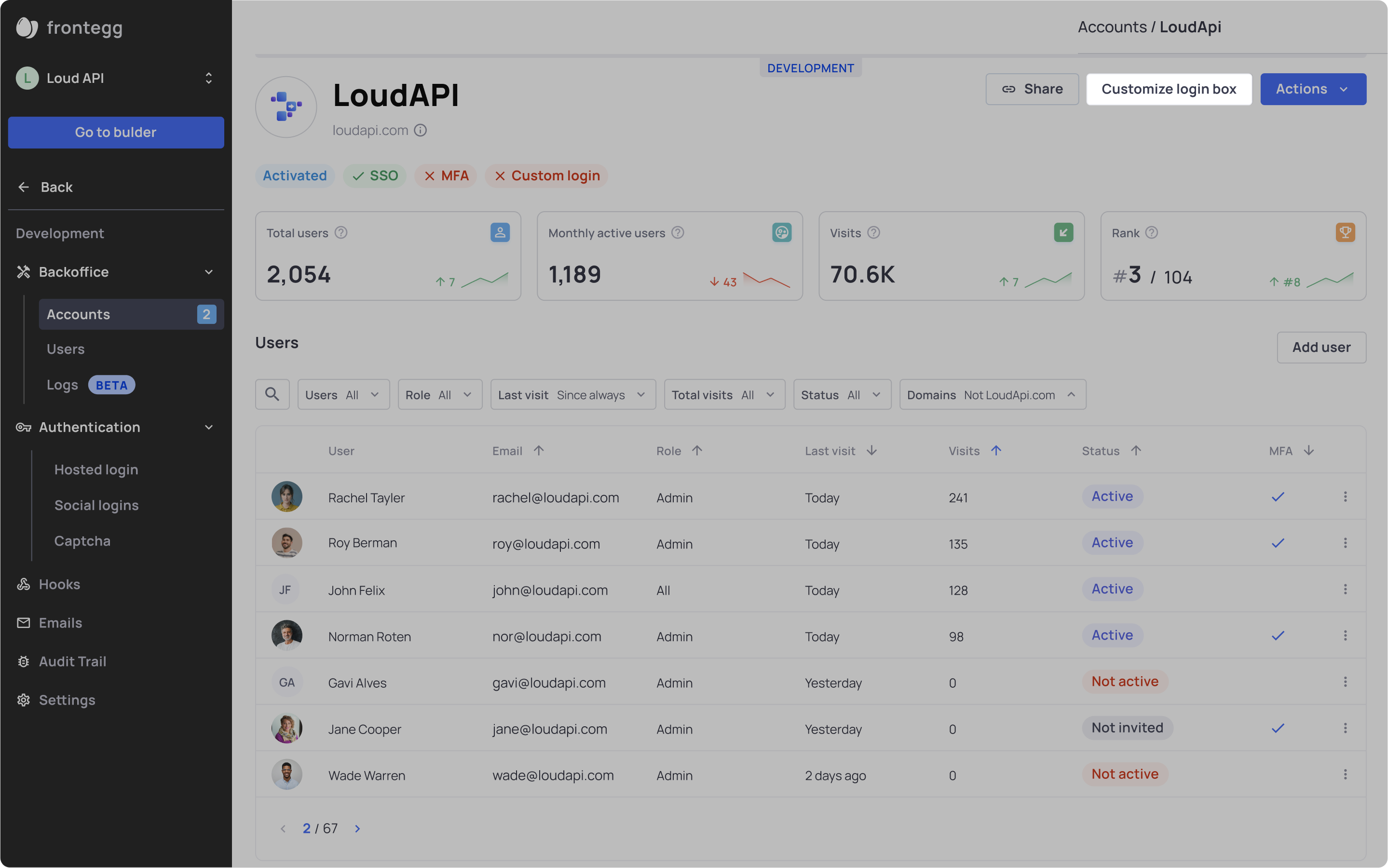
- Go to any of your environments
- Choose an account and click it
- Click on the “Customize login box” button
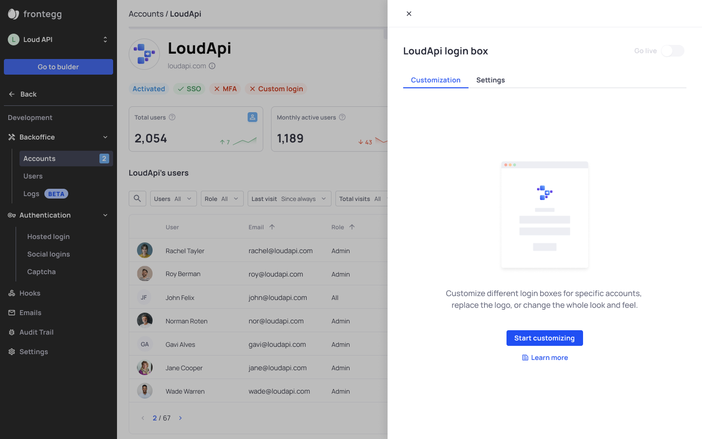
- Click “Start customizing" to get to the mini-account-builder and start managing the login-box. This is where you can edit logo, style and brand it, choose social logins and more.
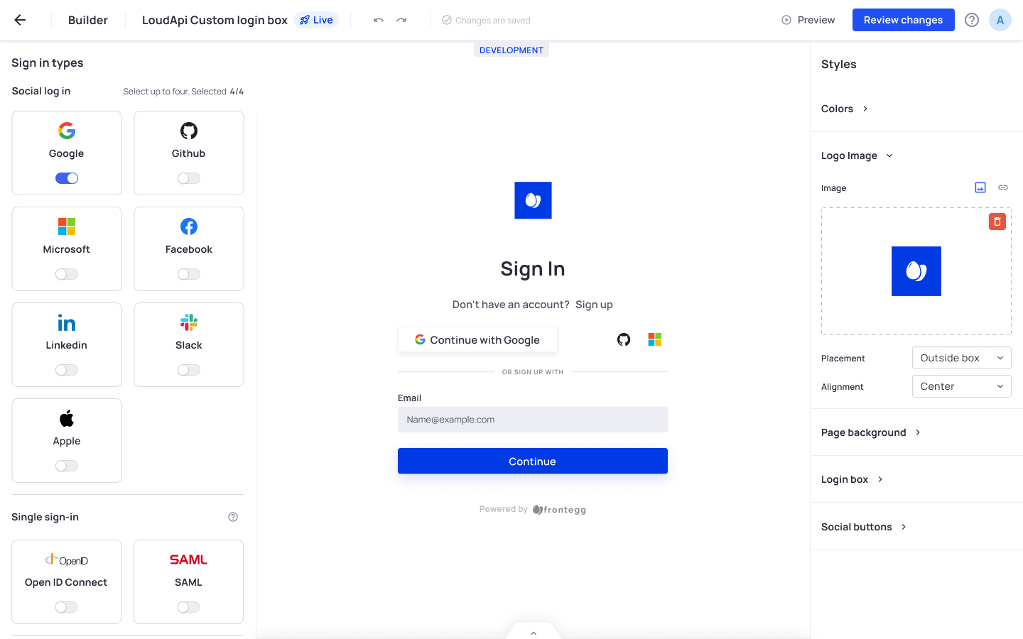
The sign-in page you’ll view on the mini builder is the state of your login configured in the main builder. Once you’ll add changes you will overwrite the sign-in page.
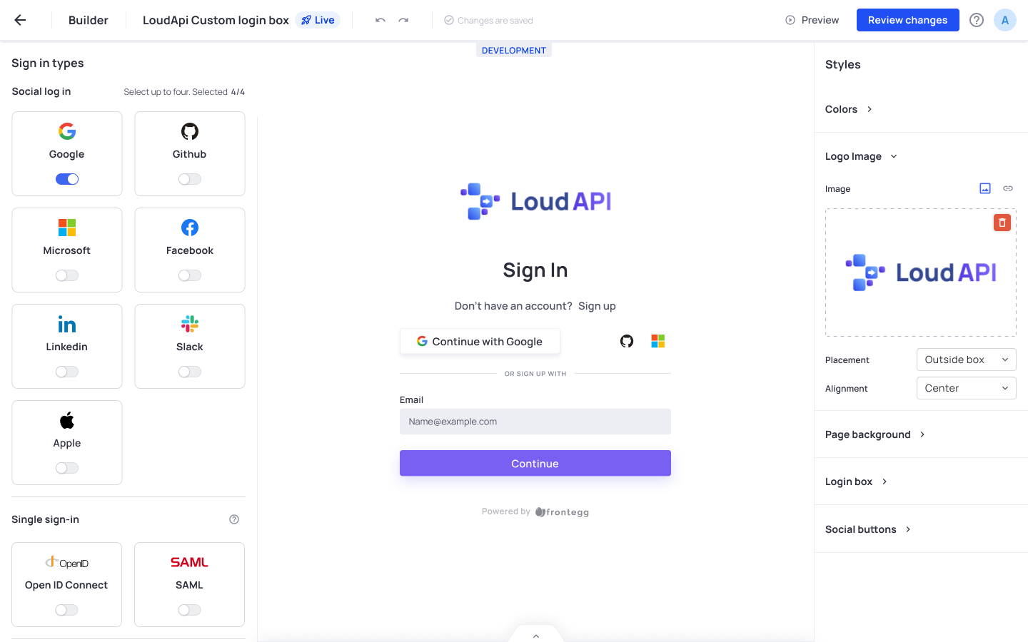
After customizing this is the result for this example would be:
Social login configurations
If you enable social logins that are different than yours (for example Google), make sure you configure them on the relevant environment in the Social Logins tab.
- Click Review changes and publish the changes to the environment you are working on.
- Go to settings tab - this is where you will determine the login URL, the redirect URL to your app, and choose the Alias.
- Login URL - This is your account’s unique login URL
| Query param | Subdomain | |
|---|---|---|
| Hosted | {YOUR_DOMAIN}.com/oauth?organization={ACCOUNT_NAME} | Same as query param |
| Embedded | {YOUR_DOMAIN}.com/?organization={ACCOUNT_NAME} | {ACCOUNT_NAME}.com |
- App URL - add your app URL, this is where your users will be redirected to after the sign in.
| Query param | Subdomain | |
|---|---|---|
| Hosted & Embedded | {DOMAIN_NAME}.com/?organization={ACCOUNT_NAME} | {ACCOUNT_NAME}.{DOMAIN_NAME}.com |
- Alias - The alias is the identifier of your account it should match exactly the
{account_name}mentioned in the points above.
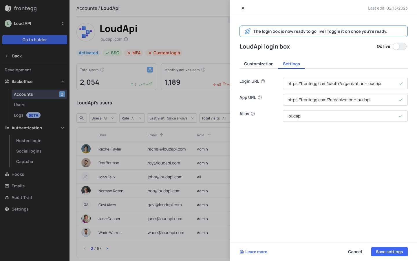
- Click “Save settings” once you are done.
- Toggle on “Go live” to publish the login page.
Now, your account's users will have their unique login link, you need to share it with them since their credentials will work only when accessing the account from this link.
Deactivating the Custom login box
You can also decide to turn off the "Go live" button, this action will in return accept the users credentials in the main login box. Make sure you update the account for this change.
Adding the account logo to the emails
If you’d like to brand the whole login flow, you’d probably want to replace the logo to the account’s logo in the emails too. In order to do that you need to edit each email template and add this;
{{#if tenant.logoUrl}}
<img height="24px" src="{{tenant.logoUrl}}" />
{{else}}
<img height="24px" src="https://picsum.photos/200/300" />
{{/if}}
Security limitations
- Moving between accounts - Users that are assigned to multiple accounts would have to re-login to an account with a unique customized login page.
- Manage MFA - the MFA requirements are based on the strictest decision - whether it is your decision or your account’s.
When enabling Custom Login Box, you are actually creating a separate workspace to the account’s users, hence eliminating the multi-tenancy aspect and allowing it’s own MFA requirements. - Sign-up to a specific account is not available at the moment for account with Custom login box. Therefore, we removed the option to add add the “Sign up” link from the mini-builder. In addition, the account’s users will be allowed to add others only by sending a specific invite.
Login Box Inheritance in Hierarchy (MSP) Models
For Tenants who manage sub-accounts (Learn more about sub-account management here), whenever a customized login box is enabled, users who are members of any of those sub-accounts will be able to log in to their account using the customized login box of their parent tenant, i.e., the customized login box configuration is inherited by the sub-accounts. Note that further customization of each sub-account is still possible, but this baseline option allows for a speedy and scalable solution.
Self-service configurations
Your customers can adjust their login box style; upload logo, change the box primary color, and change the position of their social logins, directly from the Admin portal. This functionality is enabled automatically for users with Account Settings Permissions.
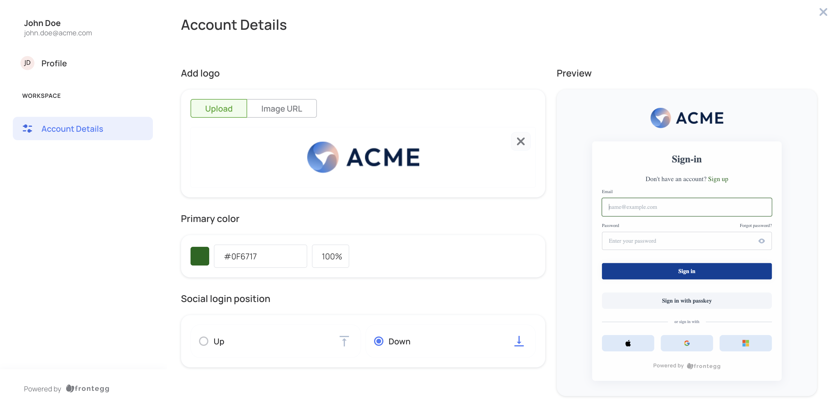
Customize your login box styling and logo
NextJS
Currently NextJS is supported only with query params
Going live checklist
- Create an environment and an account to start with
- Add the relevant tenantResolver function to your App
- Customize the login box and update the settings
- Test in testing environments
- Create the relevant custom login box for an account in Production
- Send the client their unique App URL
Updated 4 months ago